Combinations and Alliances:
Brief:
To explore and develop ideas to produce a final piece of photography through the theme of 'Combinations and Alliances.'
I have chosen a few starting points and responded to the works of photographers that have interested me through the theme of Combinations and Alliances. My research and experimentation will show a variety of techniques which i can then develop to help me produce a possible final outcome.
I have chosen a few starting points and responded to the works of photographers that have interested me through the theme of Combinations and Alliances. My research and experimentation will show a variety of techniques which i can then develop to help me produce a possible final outcome.
|
com·bi·na·tion
noun 1. the act of combining or the state of being combined. 2. a number of things combined: a combination of ideas. 3. something formed by combining: A chord is a combination of notes. 4. an alliance of persons or parties: a combination in restraint of trade. 5. the set or series of numbers or letters used in setting the mechanism of a combination lock |
al·li·ance
noun 1. the act of allying or state of being allied. 2. a formal agreement or treaty between two or more nations to cooperate for specific purposes. 3. a merging of efforts or interests by persons, families, states, or organizations: an alliance between church and state. 4. the persons or entities so allied. 5. marriage or the relationship created by marriage between the families of the bride and bridegroom. |
___________________________________________________________________________________________________________________
Visual Collage of ideas:
___________________________________________________________________________________________________________________
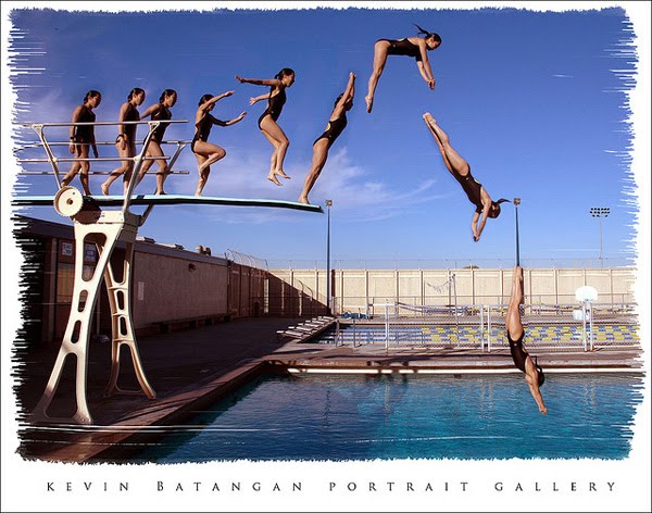
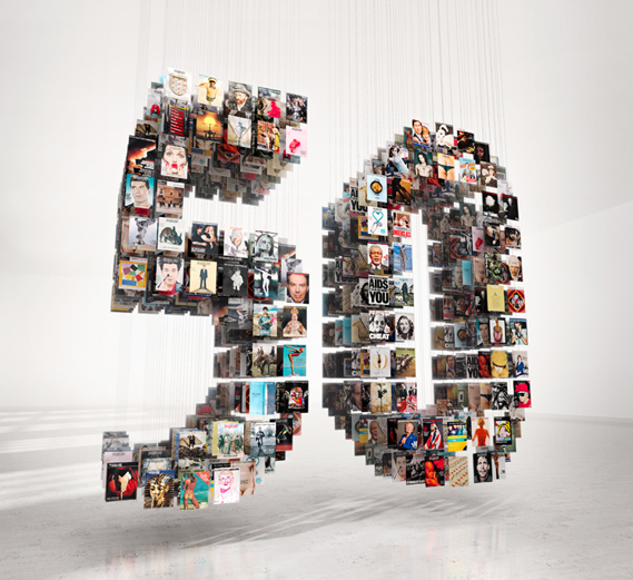
The Sunday Times Magazine 50th Anniversary - The Saatchi Gallery
50 years of The Sunday Times Magazine
Saatchi Gallery showcased the work of some of the world-famous photographers who have contributed to The Sunday Times Magazine since its launch in 1962. Photographs by Don McCullin, David Bailey, Eve Arnold, Snowdon, Sam Taylor-Wood, Terry O'Neill, Uli Weber and many more have been exhibited at the Saatchi Gallery. In February 1962, the Sunday Times launched the first colour magazine. “My God, this is going to be a disaster,” groaned Roy Thomson, the then owner of The Sunday Times. Newspapers in those days were dull dogs and the idea of putting a colourful magazine with a paper was seen as barmy. Mark Boxer, the first editor of the Magazine, later recalled, “A curious truth soon emerged: readers liked it – so much so that about a quarter of a million new readers were attracted to the newspaper.” It was not only part of Swinging London, it helped to create the 1960s spirit. It was also great fun.
Sarah Baxter, editor of The Sunday Times Magazine, said, “We’re still here and producing the most exciting journalism and photography in the business. I grew up with The Sunday Times Magazine and am proud to be continuing a glorious tradition.”
From the outset, the Magazine was innovative, enthralling readers with the peerless quality of its writing and photojournalism, while offering advertisers the opportunity to pitch their wares in full colour to a new generation of consumers. Fifty years later, and much emulated, the Magazine continues to innovate. With its unique Spectrum photography section, the Magazine remains the first port of call for the world’s best photographers and photojournalists.
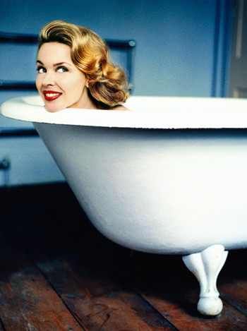
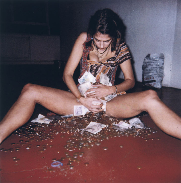
Kylie Minogue - Uli Webber
|
|
___________________________________________________________________________________________________________________
Initial Ideas:
My first responses to the theme of 'Combinations and Alliances' was the alliances between different relationships such as romantic relationships or family relations.
- Speed Dating - how couples interact in public
- Headshots of couples individually - trying to match the couples up
- Unlikely alliances
- Family alliances
___________________________________________________________________________________________________________________
Set Tasks:
We have been set a variety of set tasks to complete to help us influence the directions we would like to go in for this project. The four tasks I have chosen are:
- An alliance with the camera - one photo a day
- Photographing from a different perspective
- Stop frame animation
- Still life photography - strange juxtapositions
___________________________________________________________________________________________________________________
An Alliance with the Camera:
‘An alliance with the camera: the process of recording and documenting the everyday.’ - 'Photograph yourself each day. This could be head and shoulders or a document of everything you wear each day.
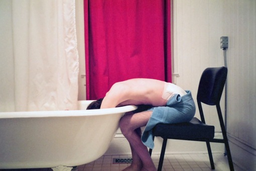
I chose to do this set task because most of my work in U3 has focused on the alliances and chemical reactions, or the alliance between people in the photograph, but i have never considered the alliance to be between me and the camera. I thought it would be interesting to see the subtle changes in appearance that we dont really notice over time, similarly to the video below of a man who photographed himself everyday for six years. I find it is quite easy to notice the subtle changes throughout the video, but it is only if you look at the first few pictures and then fast forward to the end that you really notice the huge differences in his appearance.
I chose to do this set task because most of my work in U3 has focused on the alliances and chemical reactions, or the alliance between people in the photograph, but i have never considered the alliance to be between me and the camera. I thought it would be interesting to see the subtle changes in appearance that we dont really notice over time, similarly to the video below of a man who photographed himself everyday for six years. I find it is quite easy to notice the subtle changes throughout the video, but it is only if you look at the first few pictures and then fast forward to the end that you really notice the huge differences in his appearance.
I found when looking over the photographs that girls appearances change much more everyday thats boys, for example having your hair tied up or down or wearing make up can really make a difference to what you look like. I took the photos every morning and night over two weeks so that i could see if my appearance changed from the morning to the evening, however 2 weeks isnt a very look time and i think the alteration of appearance becomes much more obvious when you take the photos over a longer period because you are much more likely to change more dramatically over 6 years than in a couple of weeks.
I do like the idea of focusing on how appearance changes though, and i think it would be quite interesting to experiment this idea with two different people, for example family members and how their appearances change to become more similar or different over time.
I do like the idea of focusing on how appearance changes though, and i think it would be quite interesting to experiment this idea with two different people, for example family members and how their appearances change to become more similar or different over time.
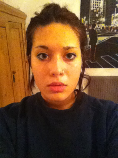
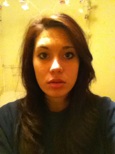
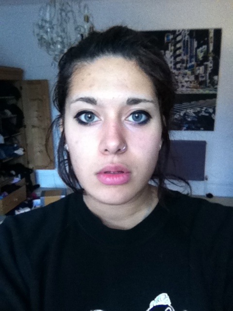
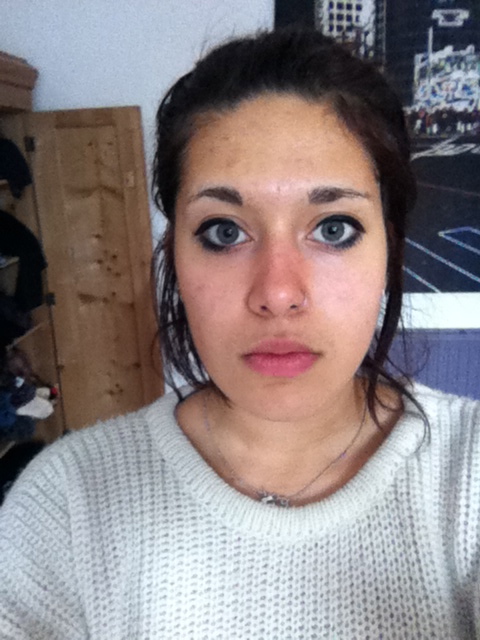
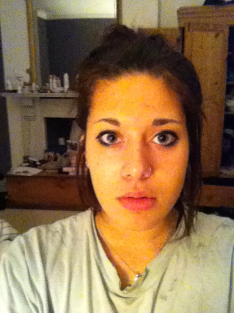
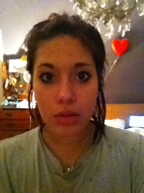
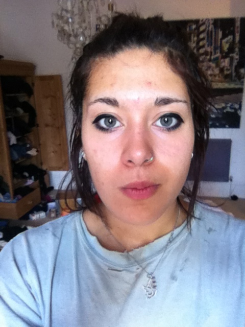
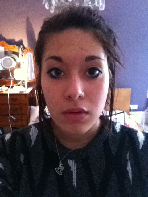
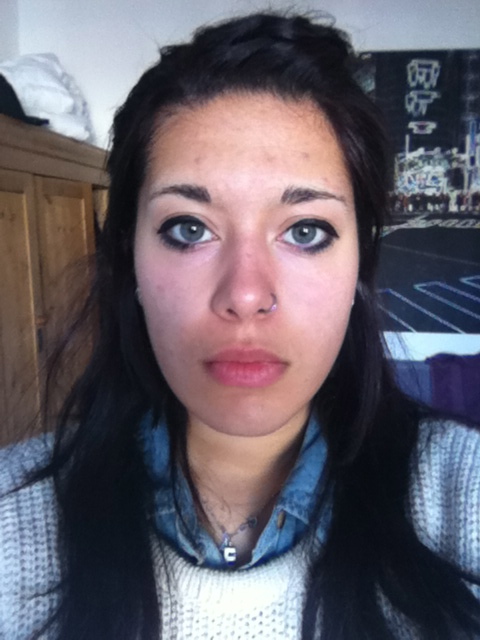
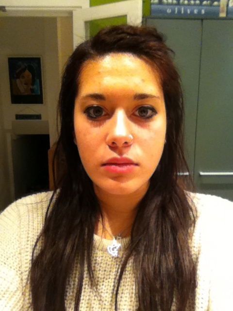
I ended up only taking about one photo a day because i kept forgetting to do the task, however i don't think it would have made much difference because 2 weeks isn't a very long time so i don't think i would have changed much throughout the task.
___________________________________________________________________________________________________________________
Jeff Harris:
Self portrait every day for 12 years: capturing a journey through life:
Using an Olympic Stylus 35mm film camera, Jeff set himself the task of taking a self-portrait every day. The result is an incredible record of his life through the ups and some very significant downs, not just for a year,but for the last 12 years; resulting in over 4748 self-portraits. In his own words, at first his shots were somewhat boring and repetitive, but using photography as a tool, he found increasingly interesting and creative ways to portray his life. The initial focus on the project was to attempt to show his life as not being a mundane 9-5 existence but to show him enjoying life to the full. As well as getting friends and family to take a shot, one of the more unique aspects to his visual diary is getting celebrities to take his picture. His creativity particularly shines through in some of these pictures, as he tries to convey the character of the celebrity through the portraits they have taken of him. In one particularly interesting series of shots, he poses as if to avoid being photographed. The photographer is Michael Moore, the renowned documentary filmmaker.The fluidity of the story is another theme running through Jeff’s pictures. In one shot, he can be seen leaping high in the air on a rock band’s stage. In the next shot we see him the emergency room being treated for a fractured foot sustained during the leap. Further daily images show Jeff’s daily routine barely changing despite being on crutches. “It gives me something to strive for, if there’s a fence I’m going to climb it, if there’s a river I’m going to canoe down it, but I’m still going.” -Jeff Harris
Using an Olympic Stylus 35mm film camera, Jeff set himself the task of taking a self-portrait every day. The result is an incredible record of his life through the ups and some very significant downs, not just for a year,but for the last 12 years; resulting in over 4748 self-portraits. In his own words, at first his shots were somewhat boring and repetitive, but using photography as a tool, he found increasingly interesting and creative ways to portray his life. The initial focus on the project was to attempt to show his life as not being a mundane 9-5 existence but to show him enjoying life to the full. As well as getting friends and family to take a shot, one of the more unique aspects to his visual diary is getting celebrities to take his picture. His creativity particularly shines through in some of these pictures, as he tries to convey the character of the celebrity through the portraits they have taken of him. In one particularly interesting series of shots, he poses as if to avoid being photographed. The photographer is Michael Moore, the renowned documentary filmmaker.The fluidity of the story is another theme running through Jeff’s pictures. In one shot, he can be seen leaping high in the air on a rock band’s stage. In the next shot we see him the emergency room being treated for a fractured foot sustained during the leap. Further daily images show Jeff’s daily routine barely changing despite being on crutches. “It gives me something to strive for, if there’s a fence I’m going to climb it, if there’s a river I’m going to canoe down it, but I’m still going.” -Jeff Harris
The project, which began long before the widespread popularity of blogging, Facebook and Flickr, allowed viewers to follow one photographer along on his adventures. “I didn’t want 365 images of me sitting on the couch each day,” says Harris. “There could have been that tendency, especially during the cold dark winter months to stay inside all the time, but this project inspired me to get out there and seek out interesting things.”
The images range from completely solitary, auto-timed self-portraits to photographs inspired by a collaborative spirit with whomever Harris encounters on a given day. Regardless of the mood, location or activity at the center of any given image in the series, they all show a marvelously open and generous approach to both diaristically recording and sharing everything from intimate moments to athletic adventures with a wider audience.
The images range from completely solitary, auto-timed self-portraits to photographs inspired by a collaborative spirit with whomever Harris encounters on a given day. Regardless of the mood, location or activity at the center of any given image in the series, they all show a marvelously open and generous approach to both diaristically recording and sharing everything from intimate moments to athletic adventures with a wider audience.
___________________________________________________________________________________________________________________
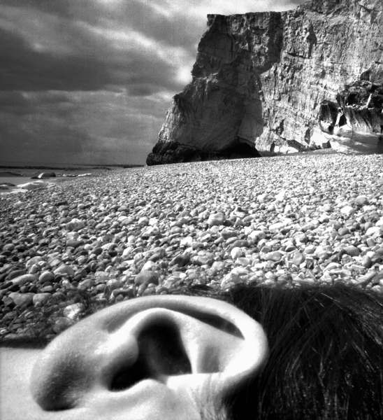
Response to Jeff Harris - A Different Perspective:
"There are always two people in every picture: the photographer and the viewer"
- Ansel Adams
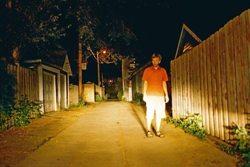
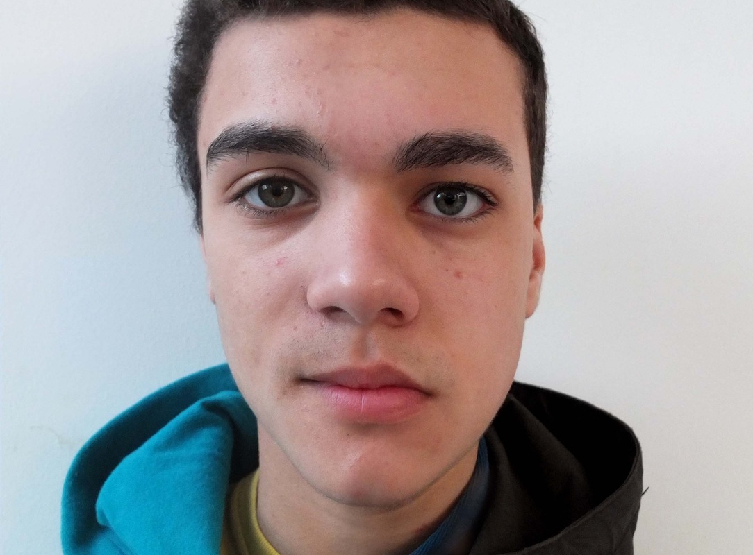
I thought it would be quite interesting to repsond to jeff harris and continue with the idea of the everyday and for me to be the focus of the picture. However, i thought that instead of looking at the change in my appearance, I could continue to be the subject of the photograph without actually being in the photo. I decided to take the photo as if it was my eyes, and follow my actions over the course of a day by photographing my every movement from waking up in the morning to going to bed at night. I thought it would be interesting to see if the camera saw anything that i had not noticed during the day, and if this had the same impact and effect that jeff harris's video had. It would also be interesting to see if there are any alliances within the environment that i hadn't yet considered.
- Ansel Adams
I thought it would be quite interesting to repsond to jeff harris and continue with the idea of the everyday and for me to be the focus of the picture. However, i thought that instead of looking at the change in my appearance, I could continue to be the subject of the photograph without actually being in the photo. I decided to take the photo as if it was my eyes, and follow my actions over the course of a day by photographing my every movement from waking up in the morning to going to bed at night. I thought it would be interesting to see if the camera saw anything that i had not noticed during the day, and if this had the same impact and effect that jeff harris's video had. It would also be interesting to see if there are any alliances within the environment that i hadn't yet considered.
Process: I created this video by taking photographs continuously of my walk to school and of certain journeys within my day using my iPhone. I took around 900 photos, which i then uploaded onto iMovie where i could collate the pictures and convert them into a video - similar to stop motion. I made each shot 0.2seconds long so that the clips would move relatively quickly to make it feel like you are the one travelling while looking at the video.
Critique: I found this process quite difficult because it was hard to take photos any quicker than i did while walking to make it look smooth, so the video turned out to be quite choppy. I initially wanted the video to be of my whole day, but i thought it would be quite boring to watch as this video is already over 2 minutes long and it very repetitive in how it is just of me walking through Muswell Hill and school. I do like how it documents my walk to school and home again because even though i am on in the pictures, it portrays me because this is something i do every single day. Jeff Harris's photos show his journey through 12 years of his life, and this video represents a journey that i have made almost every day for the past 2 years.
Further Development: I like the idea of assembling these photos together to create almost a story, so in the next task - stop frame animation - i will continue to experiment trying to tell a story by making a video out of multiple pictures.
___________________________________________________________________________________________________________________
Stop Frame Animation:
Stop motion is an animation technique to make a physically manipulated object appear to move on its own. The object is moved in small increments between individually photographed frames, creating the illusion of movement when the series of frames is played as a continuous sequence. Dolls with movable joints or clay figures are often used in stop motion for their ease of repositioning. Stop frame animations are used all the time; from music videos to just making them for fun. The idea of creating these surreal and interesting animations by manipulating inanimate objects so they appear to come to life - although a long process - always seems to have a humorous and excellent effect. There is no limit or what you can create from using any objects you have lying around at home, and some of the videos i have seen on youtube really do show that the ideas are endless, and really leave you wondering how it was made.
|
|
|
|
I had already tried making a stop motion video in my unit 3 project, but that was using people and ink on paper rather than objects, was really excited to try making my own stop frame animation where i had full control over the subject. I also found a tutorial while researching videos on youtube which gives you a tutorial on how to make a stop frame animation, which i did find quite useful.
Although the videos above are quite complicated, i thought i'd start off with something more simple where i could just experiment with the idea of stop motion and see if i wanted to take it further into my project. What i found when previously experimenting with this technique was that the hardest part wasn't actually the making of it, but instead was thinking of what it should be about. |
|
Response to Stop Frame Animation Videos:
Aim: In the video below my aim was to experiment with the process of stop motion and to create an 3D animation based on the game 'Snake'.
Process: To make this stop frame animation I used a stop motion animation HD camera which connected to the programme iStopmotion so that we could efficiently take a photograph whenever we moved the set while keeping the same settings and angle that the picture was taken. We used a piece of black and white card for the background of the set, and used sugar cubes as the snake. At the beginning of the animation we took 3 photos for each movement of the cubes, and throughout the video when the snake speeds up, we started to take only 1 or 2 photos so it appeared to move more quickly. After editing the animation, we incorporated background music using garageband to add to the video game effect.
Critique: Although this was quite a simple experiment, i think that it actually works quite well, and i think the music really enhances the animation because it might have been slightly boring if it was just silent. The only problem with this animation was that there is too much contrast between the black and white card so the camera found it hard to make the lighting even, so at parts in the video the lighting changes quite dramatically and appears overexposed so the sugar cubes aren't very visible. As the video is quite repetitive i think it is a good length so that it doesn't get too boring or tedious.
Further Development: I would like try making another animation, but i will make it slightly more difficult and interesting to watch. When researching videos on youtube i found one of a doll dancing, so as i have a wooden drawing doll with flexible limbs, i thought it would be a nice idea to try this out. I will also focus more on trying to make the lighting even so that it doesnt constantly change throughout the video.
Second Response to Stop Frame Animation:
Aim: To try making a stop motion video using a wooden drawing doll.
Process: I used a similar process as the last animation, using all the same programmes and camera, however i set up a mini studio using studio lights and white card to try and achieve even lighting, and to eliminate any shadows from the doll. Before we started the animation we chose a song which we could base the dancing of the doll on so that the dance moves would roughly line up with the beat of the music. For each movement we took two or three shots so that the movements would appear quite choppy like the 'robot' as we thought that fitted well with the music. We aimed for the animation to be about 30 seconds long - about 300 shots - so it was just a matter of planning a short dance that would be possible to do with the doll as it was quite stiff and unflexible.
Critique: I found that this animation was much more challenging to make than the snake animation as we had to keep redoing parts of the video so that it wasn't too choppy and flowed well with the music. It is quite unfortunate that you can see the edges of the background card aswell, so if i was to go further with this idea i would make sure that it was all set up properly so there was nothing distracting from the main feature. However i do really like this stop frame animation because in my opinion, humour is a major part of making these videos more interesting to watch, and i like the surreal idea of humanizing an inanimate object by making it giving it the same flexible qualities. Although the lighting still isn't perfect, it is much more constant throughout this video than the last. I also particularly like the interaction with the same at the end of the video because it is quite unexpected and adds to its comical style.
Further Development: If i was to continue with this idea, i would further try to improve the quality of the lighting and the animation overall, and i think it would also be interesting to experiment with plastersine characters because they are very flexible and easy to work with so you could easily make small adjustments to the figures throughout the animation. It is also quite exciting watching videos where the little characters have been brought to life, and there are endless possibilites to what you could make the animation about.
___________________________________________________________________________________________________________________
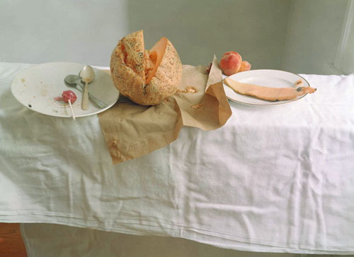
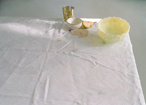
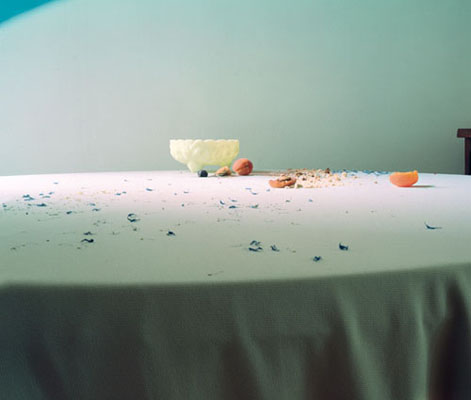
Still life photography - Laura Letinsky:
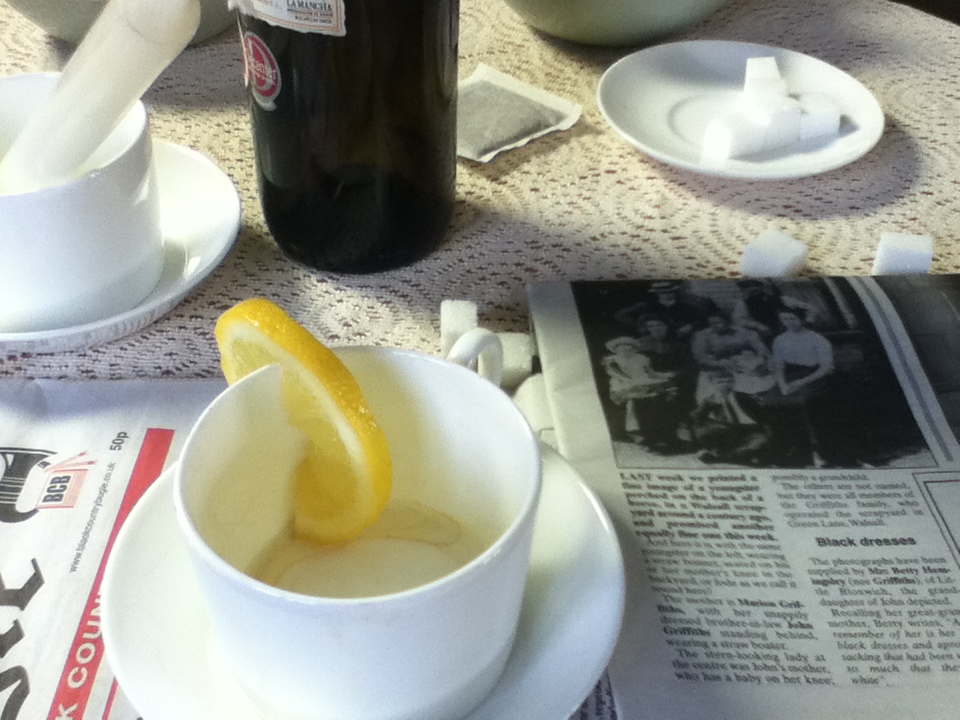
Laura Letinsky is a Canadian contemporary photographer, best know for her still life photography. Much of Letinsky's work alludes to human presence, without including any actual figures. For example, in the Morning and Melancholia, and the I Did Not Remember I Had Forgotten series, Letinsky seems to document the aftermath of a sumptuous gathering or dinner party. Faded flower petals intermingle with empty glasses and crumbs of food on partially cleared tables, often covered with a white linen that bears the mark of spilled wine. As alluded in the title Morning and Melancholia these scenes are often filled with a fresh, clear light, as though one is viewing from the perspective of the morning after, what the host failed to clean up the evening before.
"Still life is unavoidably an engagement with and commentary upon society’s material-mindedness. Laura Letinsky’s photographs of forgotten details such as wrapping paper, plastic containers, Styrofoam cups, cans, leftover food bits, and found trinkets remark upon these remnants of daily subsistence and pleasure. What is looked at is "after the fact," what (ma)lingers, what persists, and by inference, what is gone. What one sees is not always visible and Letinsky explores photography’s transformative quality, changing what is typically overlooked into something splendid in its resilience."
"Still life is unavoidably an engagement with and commentary upon society’s material-mindedness. Laura Letinsky’s photographs of forgotten details such as wrapping paper, plastic containers, Styrofoam cups, cans, leftover food bits, and found trinkets remark upon these remnants of daily subsistence and pleasure. What is looked at is "after the fact," what (ma)lingers, what persists, and by inference, what is gone. What one sees is not always visible and Letinsky explores photography’s transformative quality, changing what is typically overlooked into something splendid in its resilience."
Analysis:
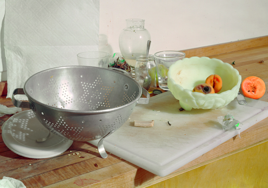
Untitled, #85, Hardly More Than Ever series, 2003
|
Form: In this photograh by Letinsky there appears to be an odd combination of kitchen utensils such as a sieve, glasses and a spoon inside one of the glasses. There are also two two full peaches - one mouldy - inside a cream bowl, as well as half a peach laying beside the bowl. The scene looks like it is set in on a kitchen top; like it is the remains of someone previously cooking and has yet to be cleared up. Many of her pictures are very minimalistic - "I strive to empty the picture of anything extraneous, anything that doesn’t need to be there."
Process: When Letinsky first began photographing still life she wanted her sets to appear more natural, however over time her pictures have become more obviously put together and artificial. She mostly constructs these sets at home or in her studio so she has full control over the lighting and the composition of her images. When she first started she used things left over on the dinner table - stuff she saw when she woke up in the morning and hadn't cleaned up. |
Content: Hardly More Than Ever is comprised of still-life colour photographs of arranged objects such as wrapping paper, plastic containers, cans, and left over food bits.They are observations of forgotten details, remnants of daily subsistence and pleasure. The still life genre is unavoidably a commentary on society's material-mindedness and the way images promote a kind of promise of attainability.I photograph the remains of meals and its refuse so as to investigate the relationships between ripeness and decay, delicary and awkwardness, control and hazardness, waste and plentitude, pleasure and sustenance. "The still life work grew out of a conglomeration of conceptual, artistic, and everyday stuff. It's very matter of factness belies its importance to issues of creaturality, domesticity, intimacy, gender, and so on. I began to see a corollary between the early global mercantile capitalism of that place and our own post-global, post-capitalist world in which objects, things, are signs of need and want, and their depiction through visual media is vital to communicate, sheesh, generate this desire."
Response to Laura Letinsky's Still Life:
What i find most interesting about Laura Letinsky's photography is that she photographs decayed and unappetizing food after it has been eaten rather than making it look appealing. I like her minimalistic approach where the darker colours of the objects in the picture really contrast with the light backgrounds; making them really stand out and become the subject of the image.
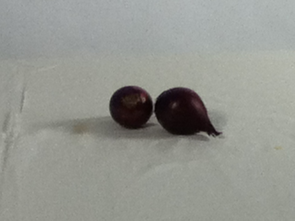
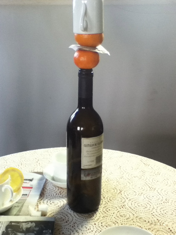
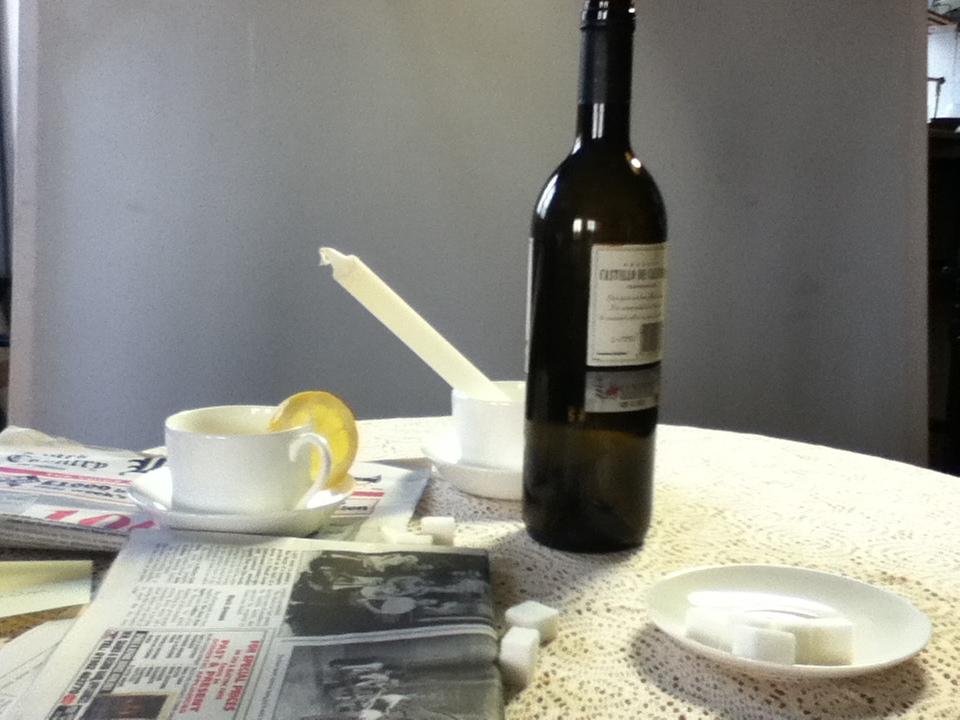
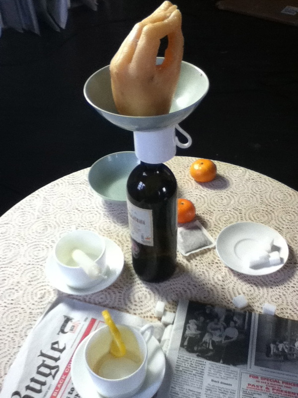
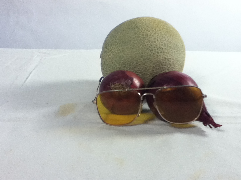
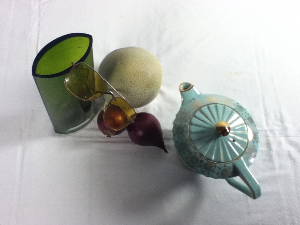
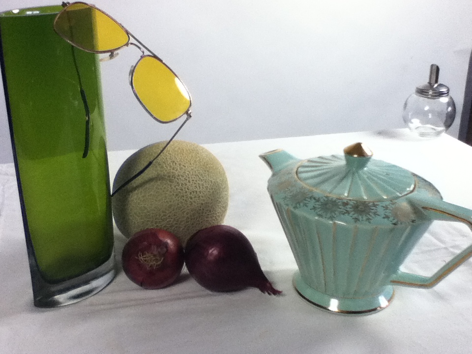
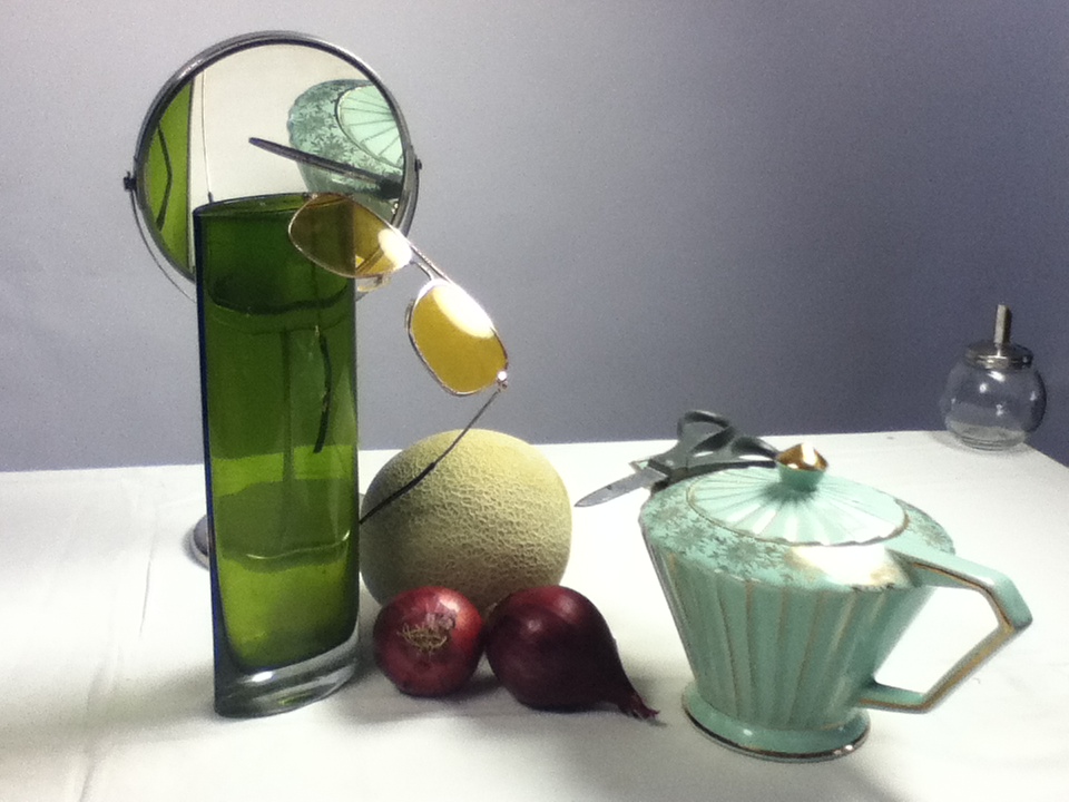
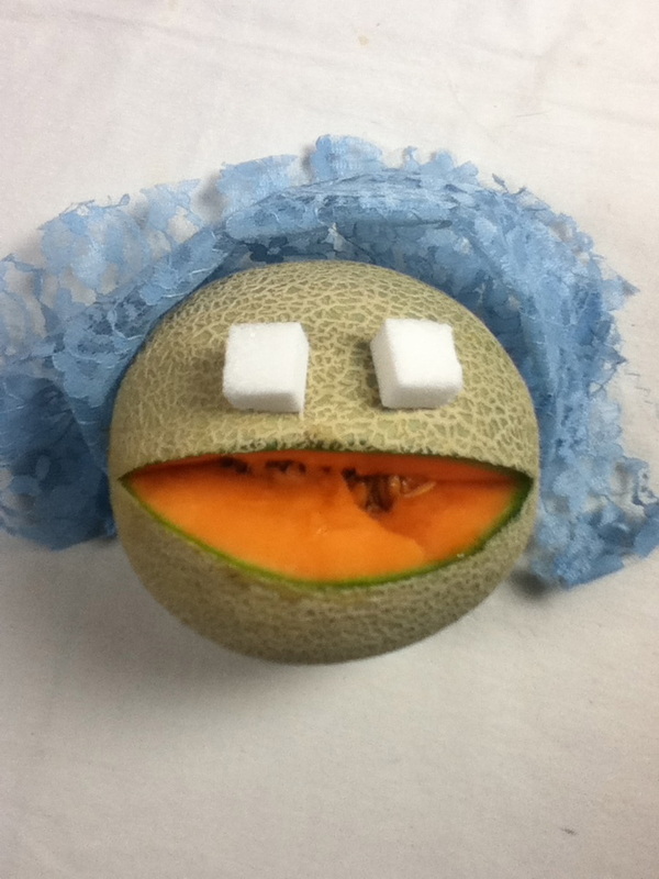
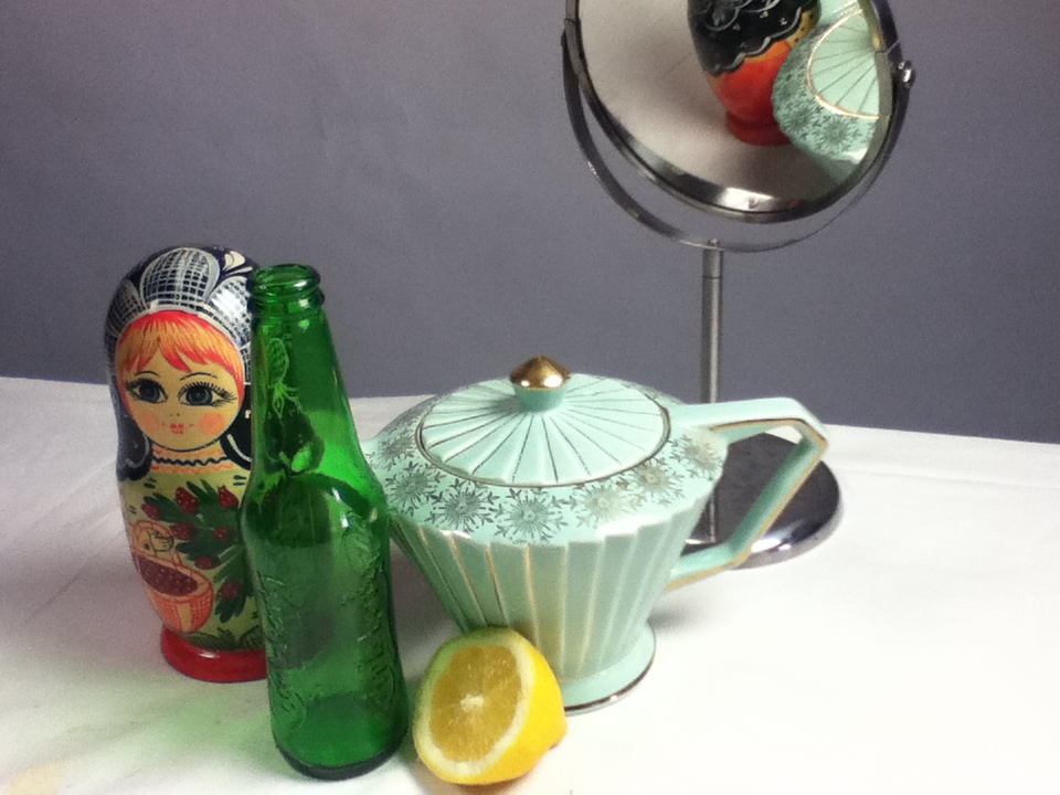
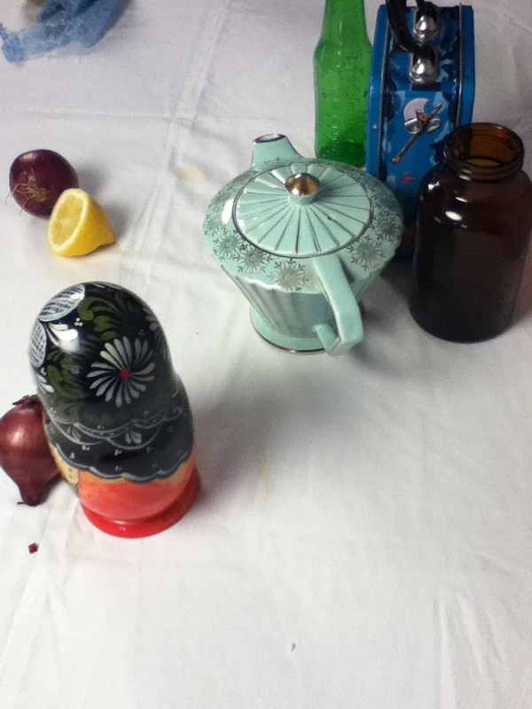
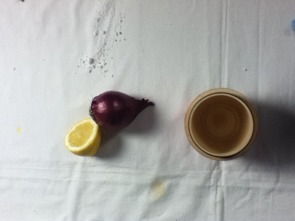
Process: For this set of photographs i responded to Letinsky's work by setting up my own unusual combination of objects in the photography studio. Similarly to Letinsky's pictures, i used a white bed sheet for the background to achieve the harsh contrast between that and the colourful objects. Although i didn't use decayed or half eaten food, i tried to photograph objects that didn't fit together - for example a russian doll and a teapot, or a wax hand and a bottle of wine. While setting the photos up i focused mainly on the balance and composition of the picture as this is what makes Letinsky's images so effective.
Critique: I quite like the composition of some of these photographs, and i think i achieved the surreal effect that i wanted to create. However i think i could have made more use of the studio lighting as Letinsky's images are much brighter with fewer shadows from the objects, and mine appear a little dim, and i find the shadows take away from the photo slightly. As i took these photos using my iphone, i think the quality of the pictures may have been better had i used a different camera.
Further Development: If i were to continue photographing still life, i would try capturing more contrast and variation within the images; incorporating the theme of decay into my pictures aswell. However i didn't find photographing still life objects particularly interesting, and don't think i will continue in this direction.
___________________________________________________________________________________________________________________
After experimenting with the set tasks, i have decided that i would like to go in the direction of one of my initials ideas 'Family Alliances', however after looking at the video of Noah who took a photo of himself everyday, i quite liked the idea of looking at the changes in appearances between family members. I think it would be interesting to see how people in my families have changed in appearance, and how they resemble or differ fro each other. I would like to explore further into different techniques and ideas to execute the idea of portraying and documenting the human face.
___________________________________________________________________________________________________________________
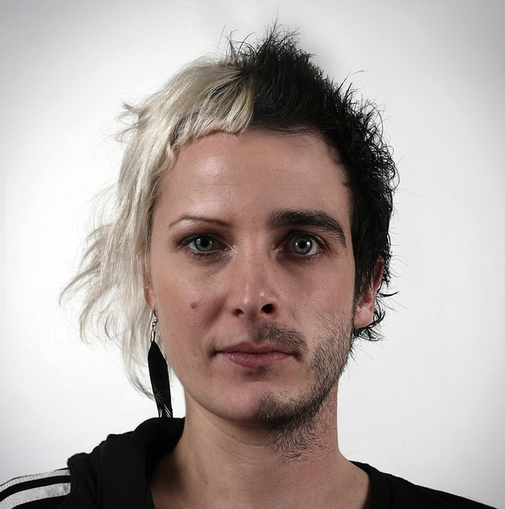
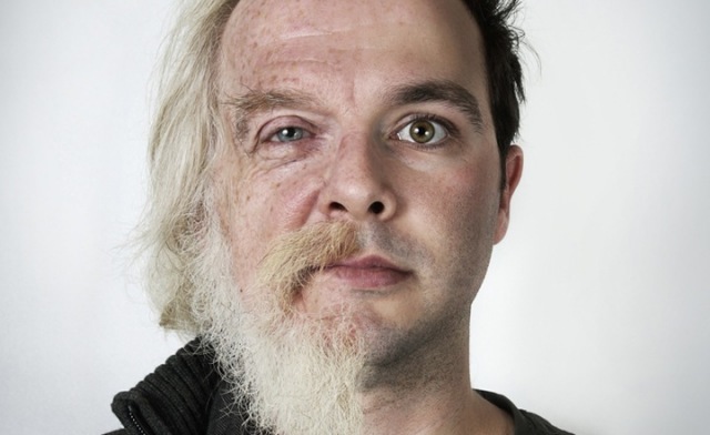
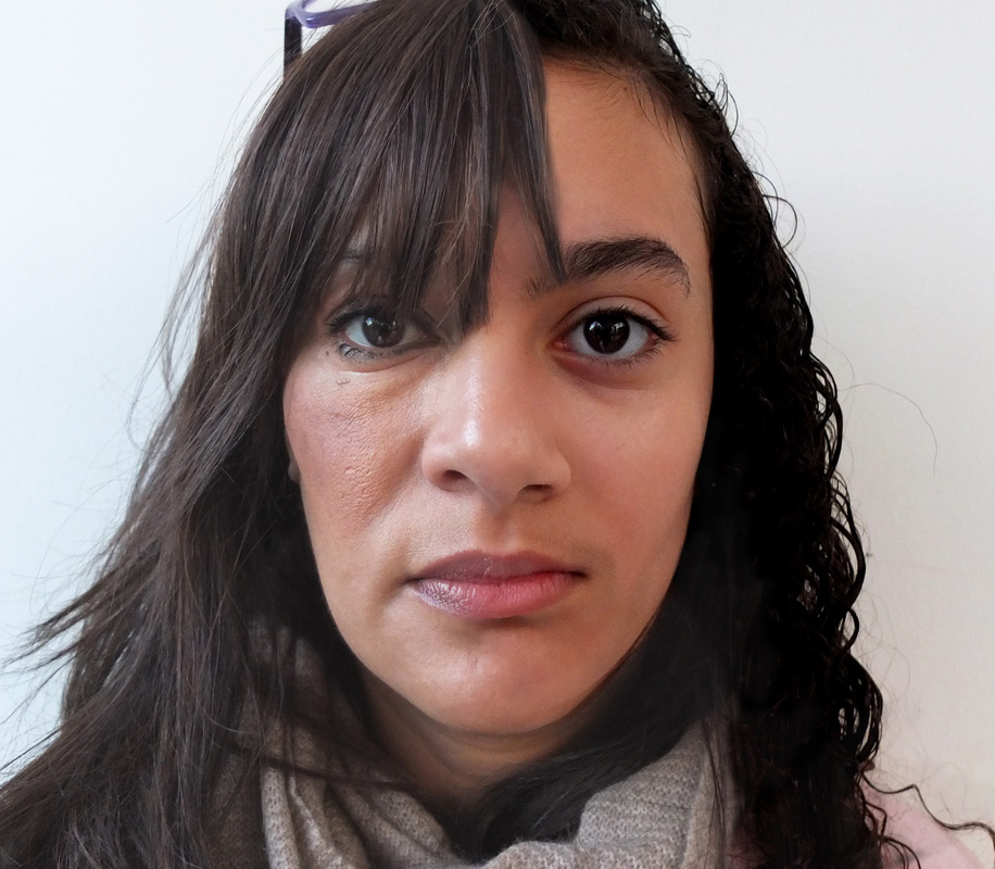
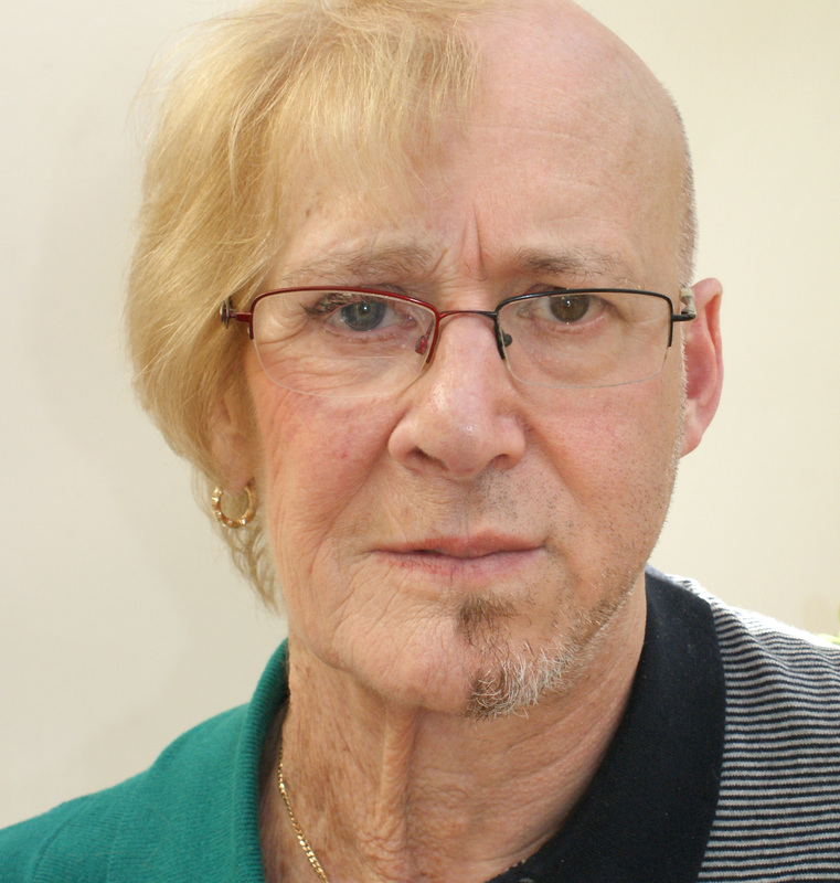
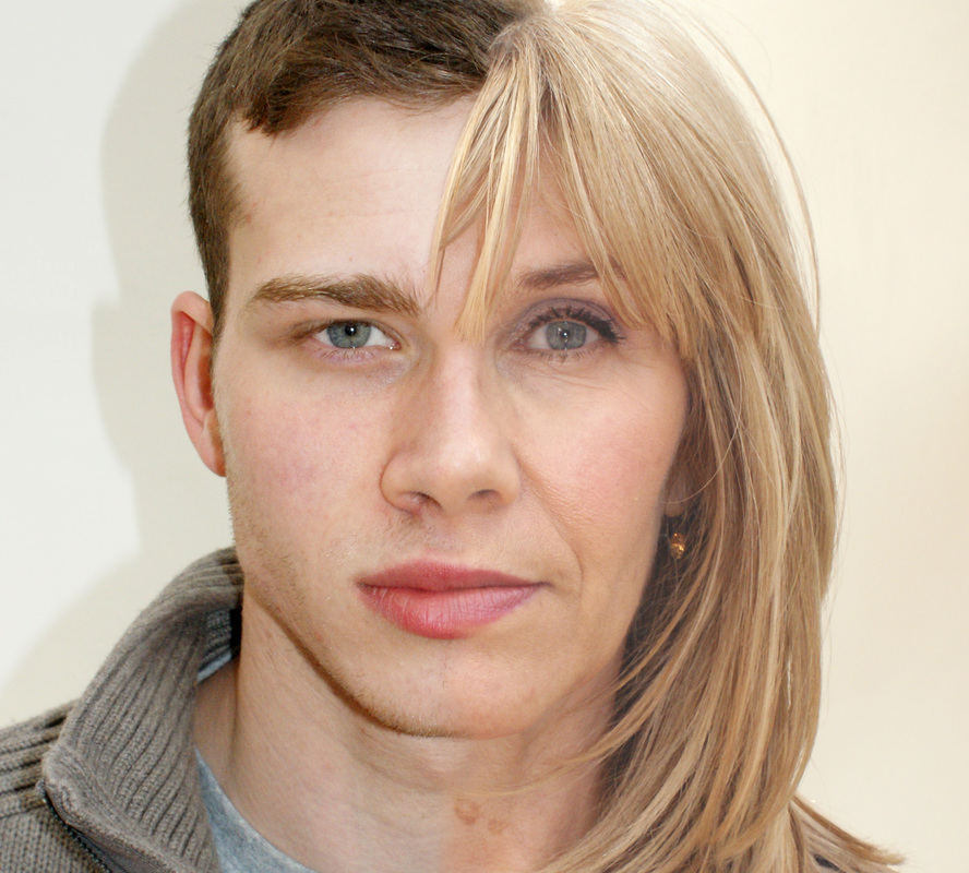
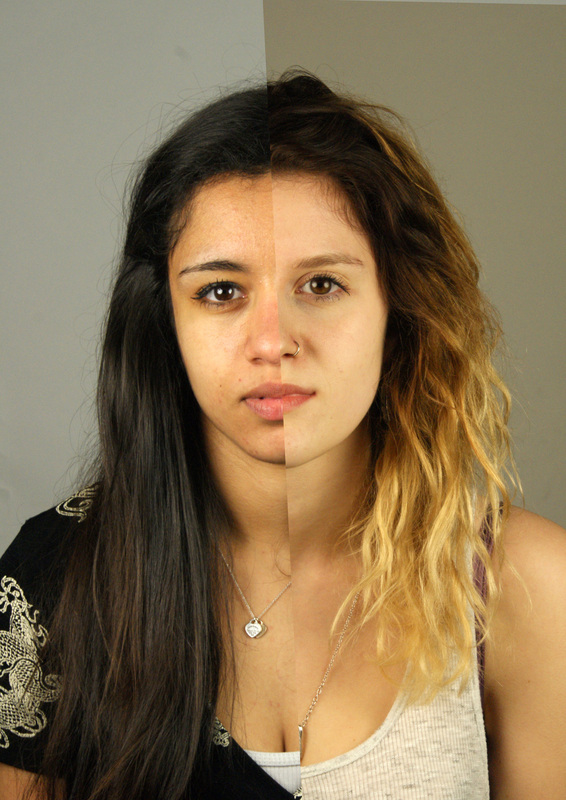
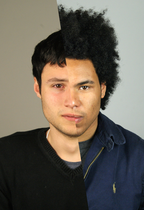
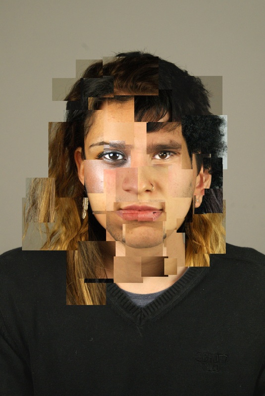
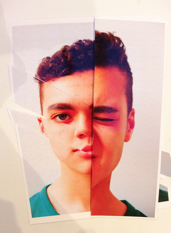
Ulric Collette: 'Genetic Portraits'
Ulric Collette, a Canadian photographer, explores the facial similarities of relatives by merging their faces together into a single portrait. His ongoing project mostly concentrates on father/son, mother/daughter and sibling/sibling comparisons. The idea of creating these genetic portraits was originally an accident from trying to age his son in Photoshop, where he ended up splicing together photographs of himself and his son. By splitting the faces in half and combining them he creates interesting and entirely new relatives which mostly quite normal looking. Often, the faces of close relatives – twins, for example, or mothers and daughters – combine to make images I couldn’t immediately recognize as composites. Sometimes the effect is more like looking into a time warp, the younger version on one side and the older on the other.
"There's always something, a particular physical trait or characteristic that helps merge siblings together. Sometime it's the eyes, nose or mouth and sometime it's only the facial structure."
His portraits mainly identify and portray particular features and similar aspects and features of the faces of family members, showing features that may not have been considered very similar in a completely different perspective. Certain images, however, draw attention to dissimilarities more than likenesses, particularly in those pairing distant relatives, or men and women.
Analysis:
Form: This is a portrait of Ulric, age 29, and his son, age 7. Each face has been split down the middle and joined to the other face, producing a combined face of the two portraits. The photo appears to be taken in the studio against a white background and using studio lighting as the lighting is even and there are no shadows behind the figure.
Process: Collette firstly took portrait photographs of different family members in a studio using a digital camera; making sure the faces in each photograph were well lit. He then simply combined two separate portraits; in this case a portrait of his son and one of himself and using Photoshop, he edited the skin and hair to improve the quality of the new image.
Content: Although these images were intially an accident, Collette continued the series simply to reveal the similarities and differences between the appearance of family members. He found it interesting how while some of the final images appeared to look quite alien and unusual, others really demonstrated and enhanced the likeness of relatives; especially in photographs of two people of the same gender.
___________________________________________________________________________________________________________________
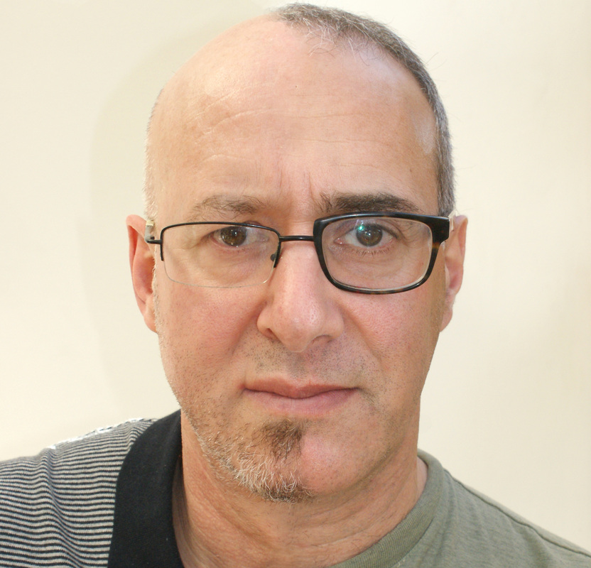
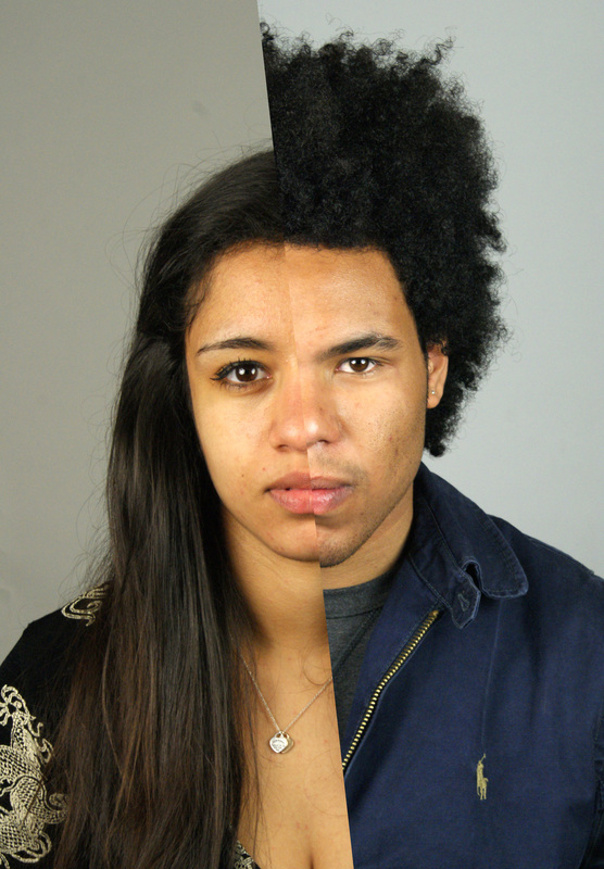
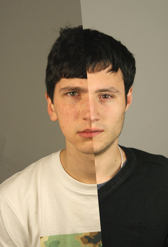
Response to Uric Collette:
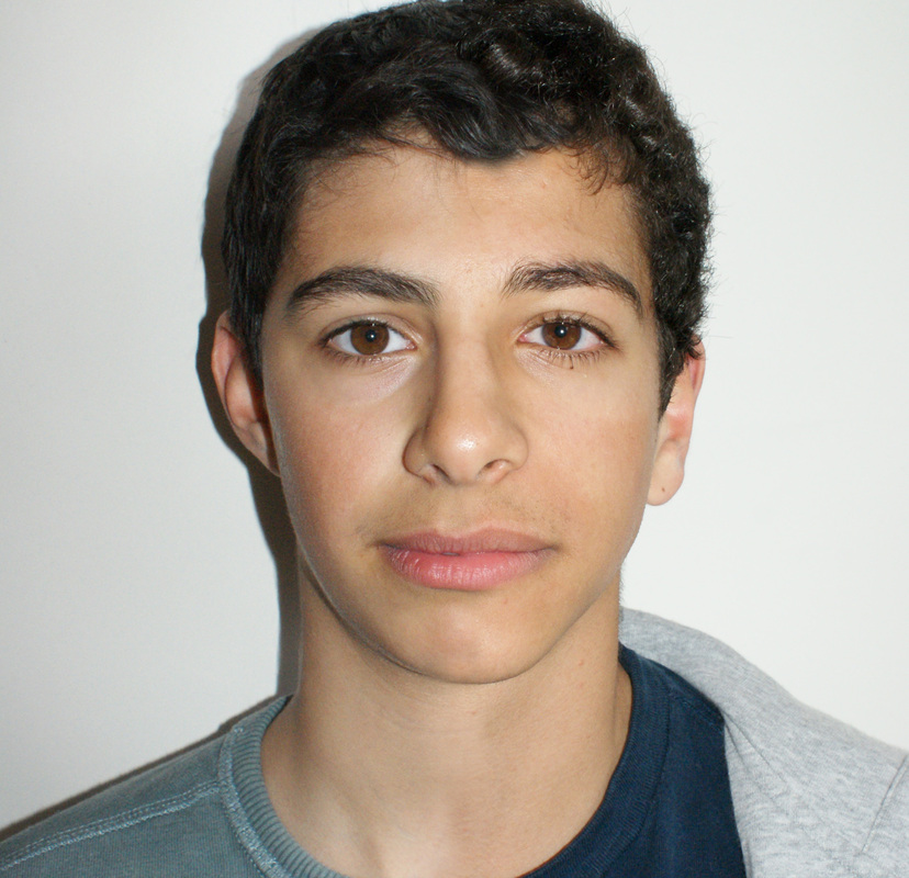
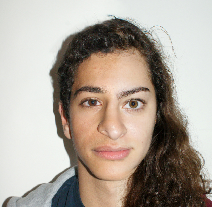
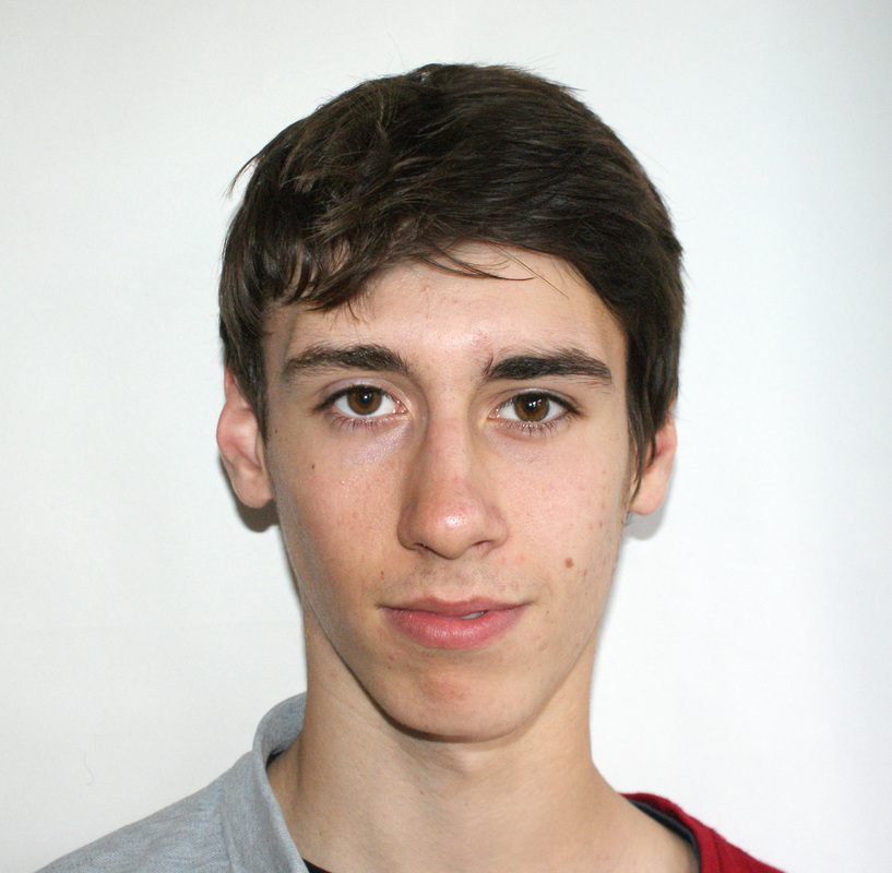
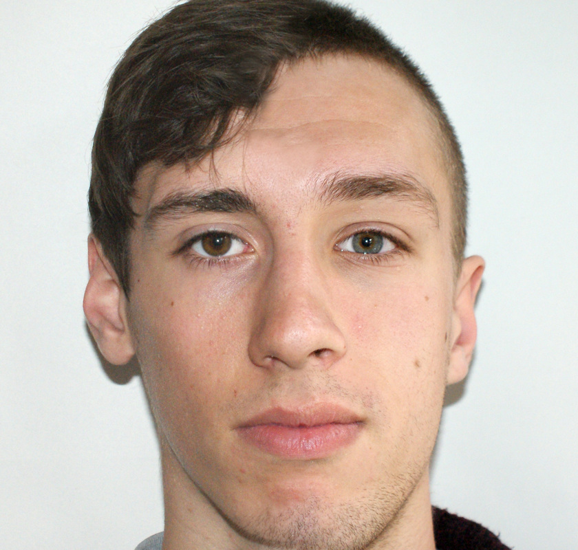
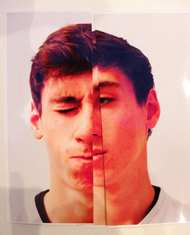
Aim: To try and respond to the images by Ulric Collette by combining photographs of my family members in an attempt to create 'new relatives' using photoshop.
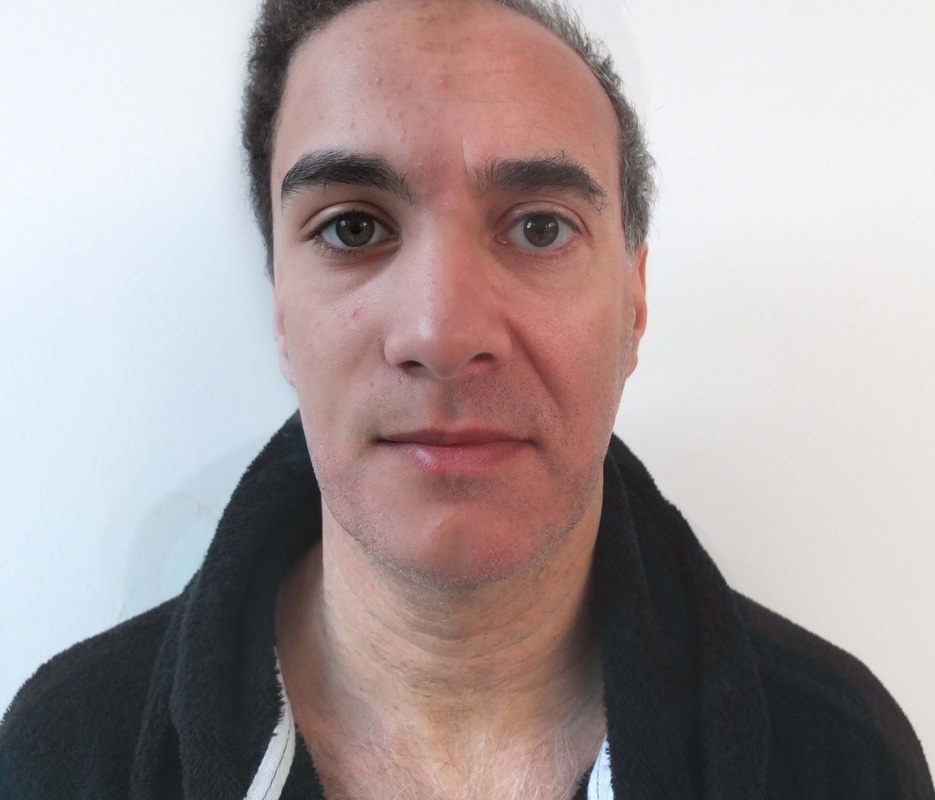
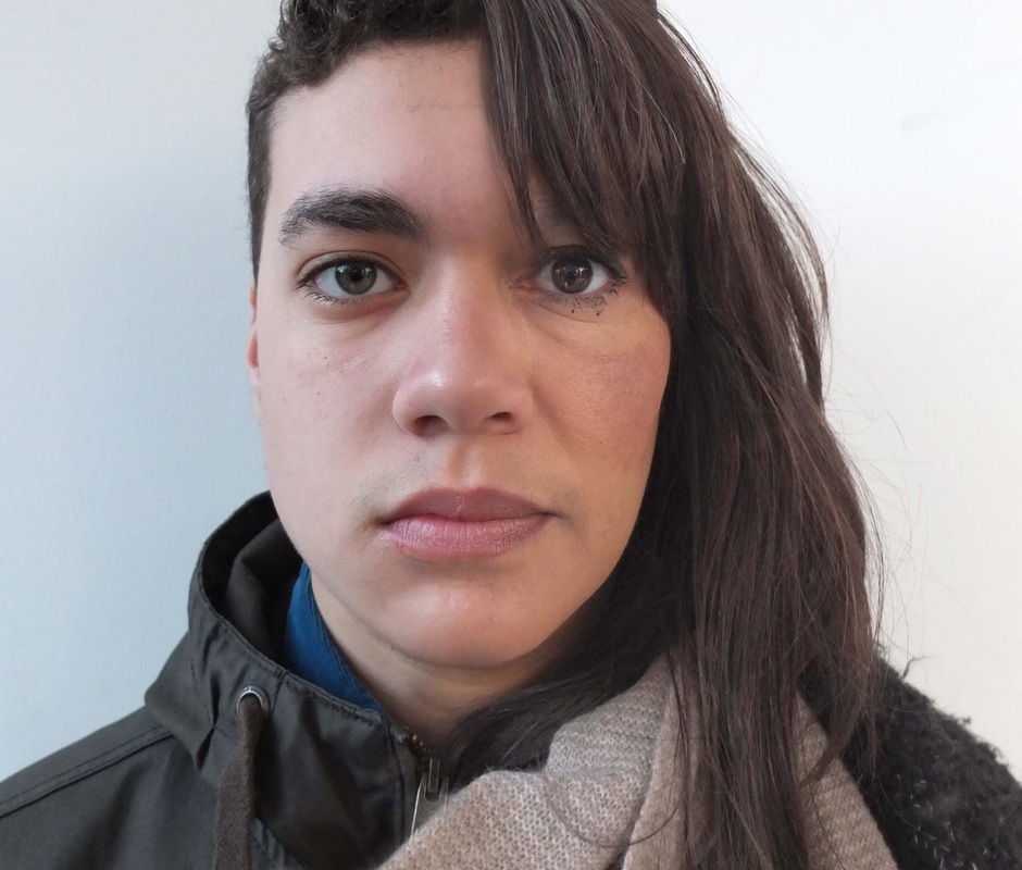
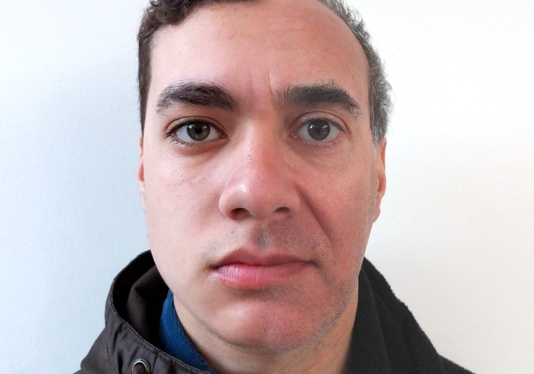
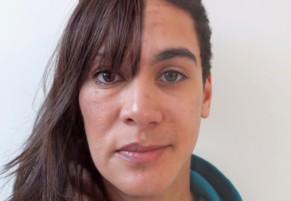
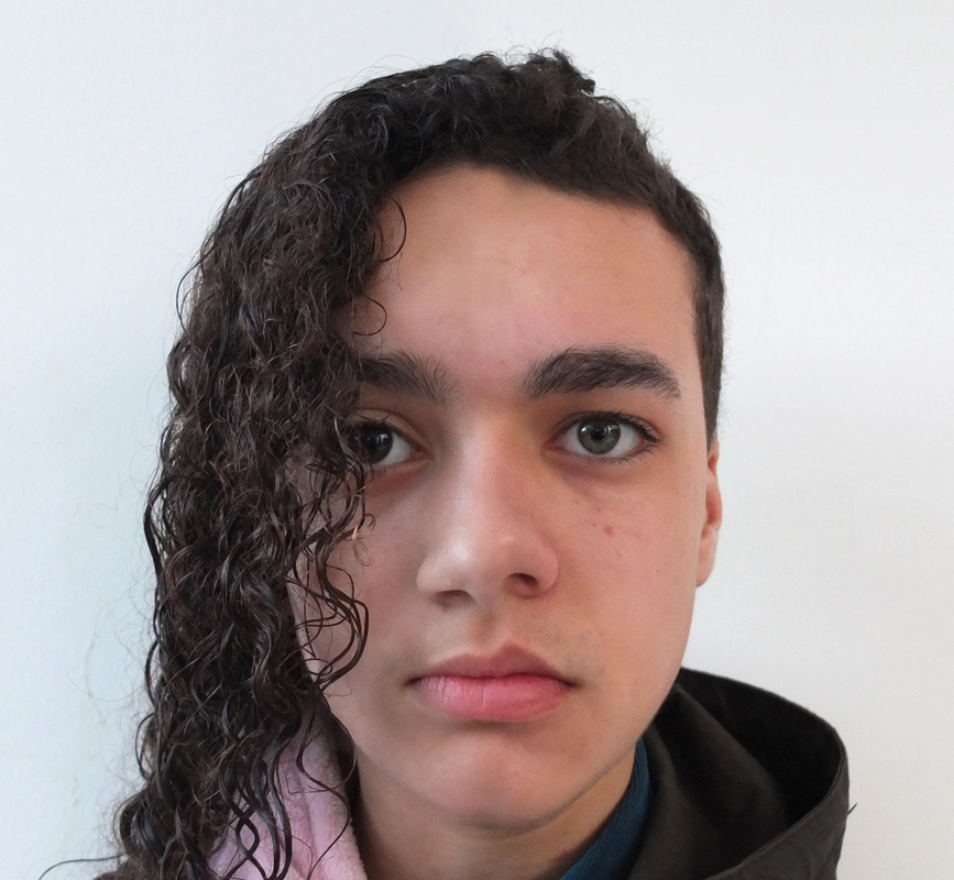
Process: For this set I took individual portrait photographs of myself and different members of my family using a digital camera. Unlike Collette, I took the photos in daylight using natural lighting against a plain white wall so that the faces were well lit and there were no distracting patterns in the image. I then used the same technique as Collette to merge the faces together; cutting the faces in half and combining them on photoshop, making sure most of the features matched together. I made adjustments so that the lighting and colour were similar for both portraits, and then used the paintbrush tool to hide the line where the two photographs meet.
Critique: Even though some of the combined portraits look very odd and deformed, I thought particular images for example of my dad and brothers and my mum and louis worked really well because they already look quite similar to each other. In some of the pictures i found it quite hard because one of the faces was longer than the other, so had to adjust them quite a bit which may have distorted the final image. I also found that although i used the same setting and used the same amount of light for each picture, some of the photos were still darker than others which means they didn't match up as well.
Further Development: I would really like to continue with this techniuque because i found it quite surreal and extraordinary seeing how similar some of my family members actually look even though i don't notice the similarities when i see them individually. I would like to experiment with this idea using my extended family, as it would be interesting to see if there are any resemblances there aswell. I will also try to focus on getting similar lighting with all the photographs so that the merging appears much more natural than the set above.
___________________________________________________________________________________________________________________
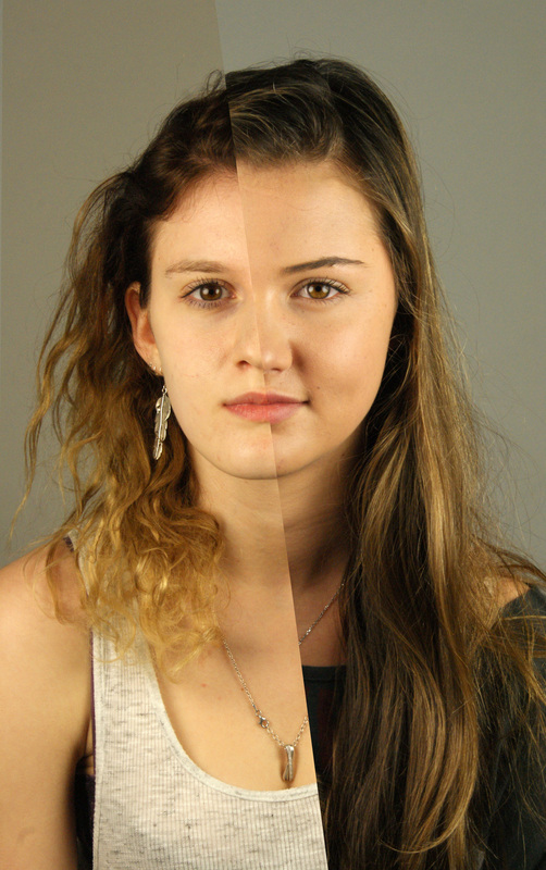
Aim: My aim for this set of photos is to continue with the same technique as my previous set, but to focus more on the lighting while taking the images to improve the quality of the final outcome.
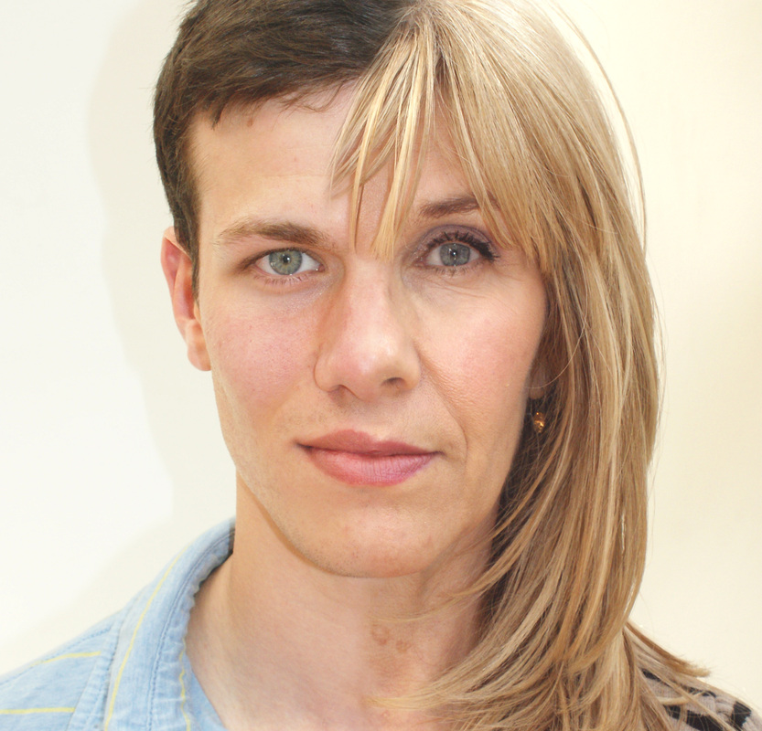
Process: I used the same process as my previous set; using my digital camera and natural lighting. However for this set i aimed to accomplish similar lighting for each photograph so that it would be easier to combine the faces without it looking too artificial. I made sure i took these photos on a bright day, and also used fill in flash so there would be even lighting across each face. I also photographed the subjects in the same position so they would be similar colours and brightness and so some wouldn't have shadows on their face.
Critique: Even though i tried to avoid this, i found that some photos had more of a yellowy tinge to them than others, and were slightly brighter which meant it was more difficult to merge some of the faces together. Like the previous set, i found that some of my family members appear really similar in the photos, and almost look like it could be one person; especially with brothers. Some of the images don't look as good because the lighting was still slightly similar even after i edited them on photoshop, so you can see the smudged line where i joined their faces together.
Further Development: I think that images of siblings are the most effective and have the most similarities, so i would like to try another set using this technique but only focusing on siblings. I would also like to try this using twins, because it would be interesting to see if they actually look as similar as you think they do, and if the resulting images looks like one of them more than the other.
___________________________________________________________________________________________________________________
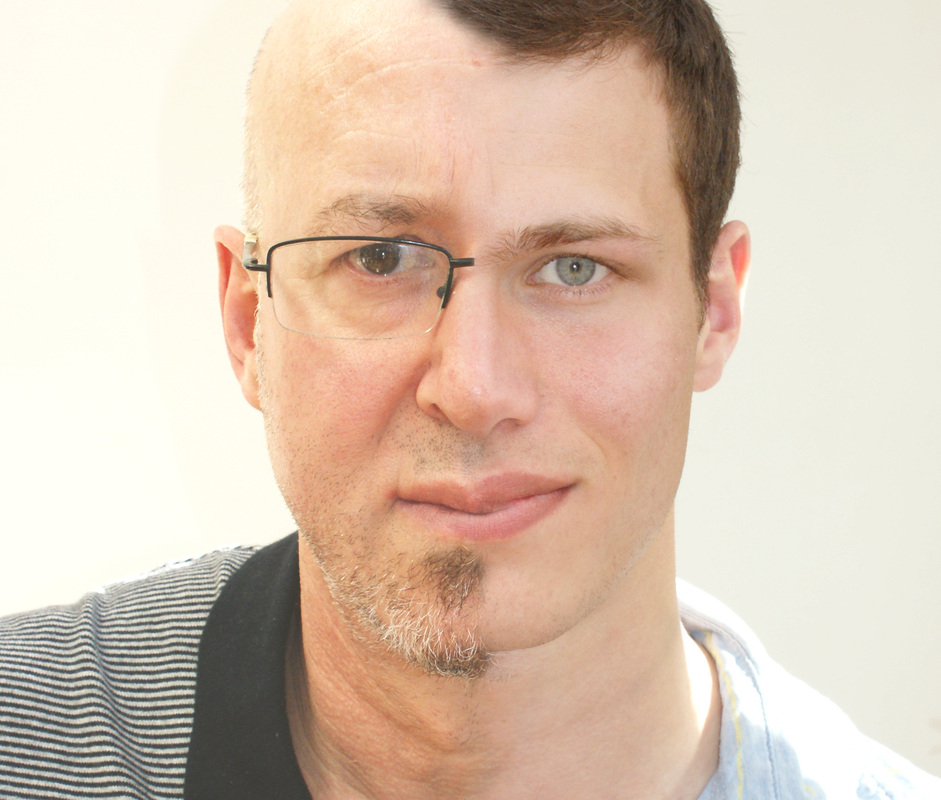
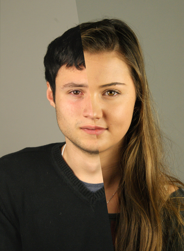
Aim: To experiment using this technique with siblings which appear to look quite similar to each other.
Process: For this set i used siblings from families who i think look similar to each other, and wanted to see if they really looked as much alike as i thought. I took the photos against a wide piece of card, using natural lighting with a fill in flash so that there were no dark patches on the faces.
Critique: I thought it was interesting that even though some of the siblings look really similar when you look at the individually, some of the images above look very unusual and the faces don't fit because of only the nose or one of the heads being much smaller than the other. What i found most interesting was the photo with the identical twins, because the resulting image looked much more like one twin than the other; even though they are supposed to look the same there are still little differences in their appearance which are much less obvious when you look at them separately. I thought the lighting for these photographs was much more consistent than the last two sets, as well as the lighting and colour matching the photo i paired it with.
Further Development: I have liked this idea of marrying two separate photographs of relatives to create a character that neither looks alike or dissimilar to the two individuals. A possible outcome would be making a sort of family tree using the images of my family, which i think work the best and mounting them on a piece of white card.
___________________________________________________________________________________________________________________
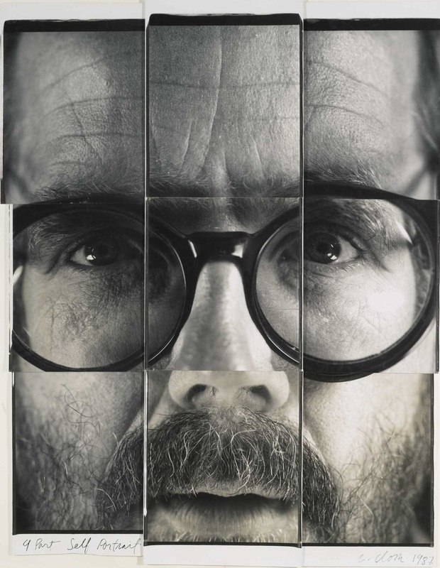
John Stezaker:
Stezaker is a British conceptual artist who creates surreal collages using pre-existing images such as classic movie stills, vintage postcards, publicity photographs and book illustrations. He creates new unique works of art by adjusting, slicing, and inverting separate pictures together. Art historian Julian Stallabrass said:
"The contrast at the heart of these works [by Stezaker] is not between represented and real, but between the unknowing primitives of popular culture, and the conscious, ironic artist and viewer of post-modern images."
His 'Marriage' series is a creation of hybrid icons; dissociating the familiar to create sensation of the uncanny. Coupling male and female identity into unified characters, Stezaker points to a disjointed harmony, where the irreconciliation of differences both compliments and detracts from the whole. He transorms these found portraits using a manual cut and paste technique. His subtle and unsettling technique manipulates the naturalistic pictures; toying with the subconscious and the surreal, and fragmenting our view of contemporary reality. Stezaker's 'Dark Star' series turns publicity portraits into cut-out silhouettes, creating an ambiguous presence in the place of the absent celebrity.
"A lot of what I do is trying to see the world as a series of ghosts. That’s the only way I can explain it, but it does seem to have an urgency in the present. I have a certain horror of nostalgia, for me it’s a very current concern. There’s a certain horror with the past."
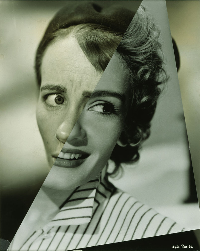
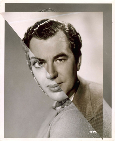
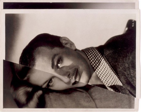
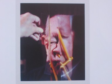
Aside from the fact that he doesn't use relatives, Stezaker's work is very similar to Ulric Collette as they both consist of joining two portraits together to create a unique character. Stezaker's work is much more rough as the edge of the photographs are not aligned and are quite uneven, and you can also see very clearly where the two faces meet in the middle. I quite like this more irregular technique of merging the photographs together, and would like to try it using the pictures i have taken of my classmates below.
___________________________________________________________________________________________________________________
Aim: To create a response to John Stezaker's technique by combining the photographs of my classmate which i took in the studio together on photoshop.
Process: Using photographs i took in the studio, i used the polygonal lasso tool to cut each photo in half straight through the middle of the face. I then copy and pasted the selected area onto a different image and lined the faces up to most of the features matched together - changing the size and lighting of the photos so they were more similar.
Critique: I thought it was really interesting how most of the faces fit almost perfectly together, and in some cases they actually look like a normal face compared to the more alien-like images by Stezaker. However i like the roughness of Stezaker's images and i found it quite hard to get this effect using photoshop as apposed to doing it manually like he did. I think being able to see the edges of the photographs adds to the surrealistic and fragmented affect which the photos portray of contemporary reality. I think the edges are in fact part of the collage adopted by Stezaker, and cropping or editing them out would really detract from the image.
Further Development: Instead of repeating this technique but doing it manually, i thought it would be interesting to maybe combine one or two features of a face with a different face to create an even more distorted and fragmented photo.
___________________________________________________________________________________________________________________
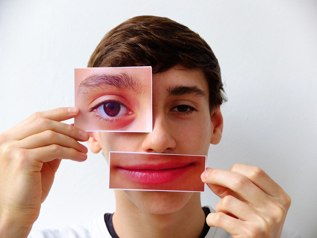
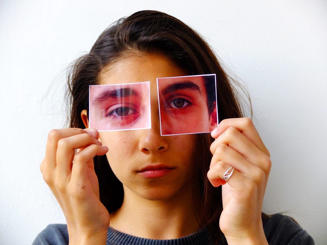
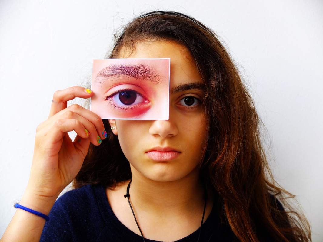
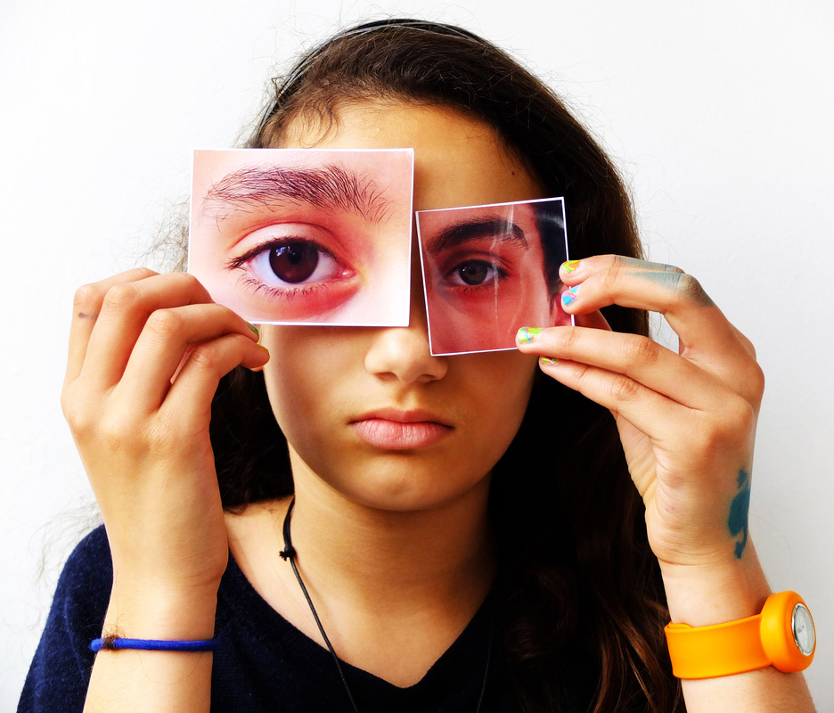
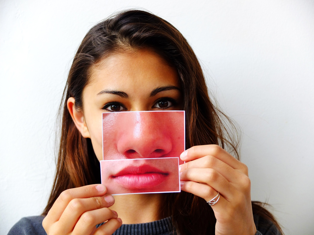
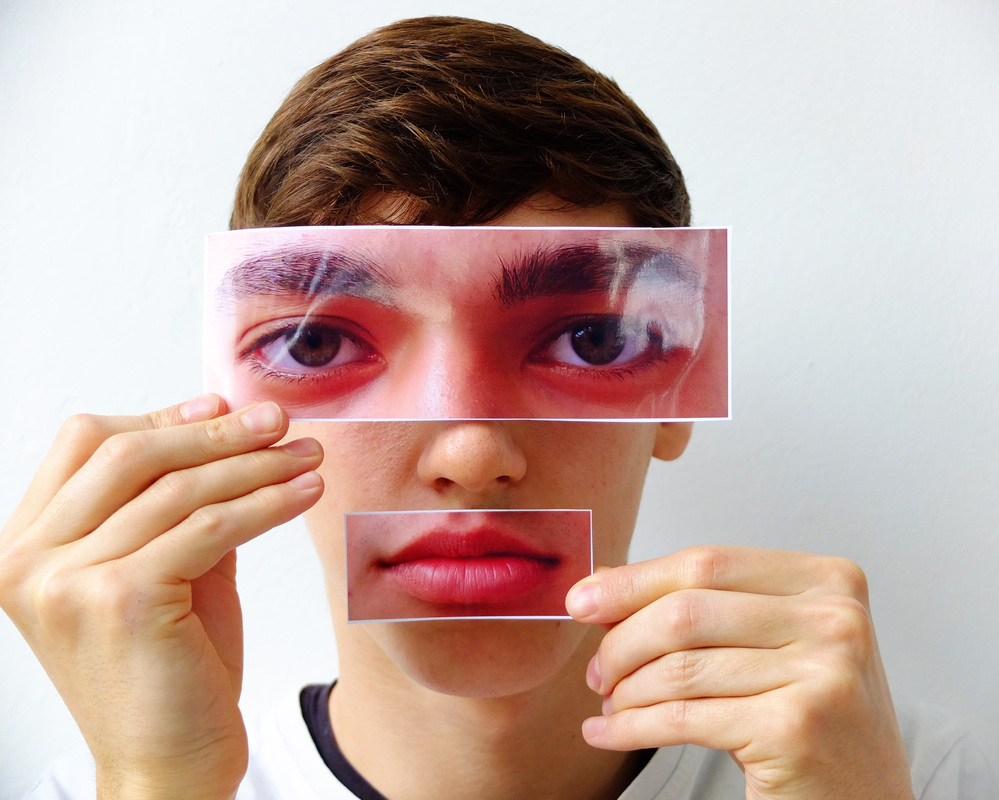
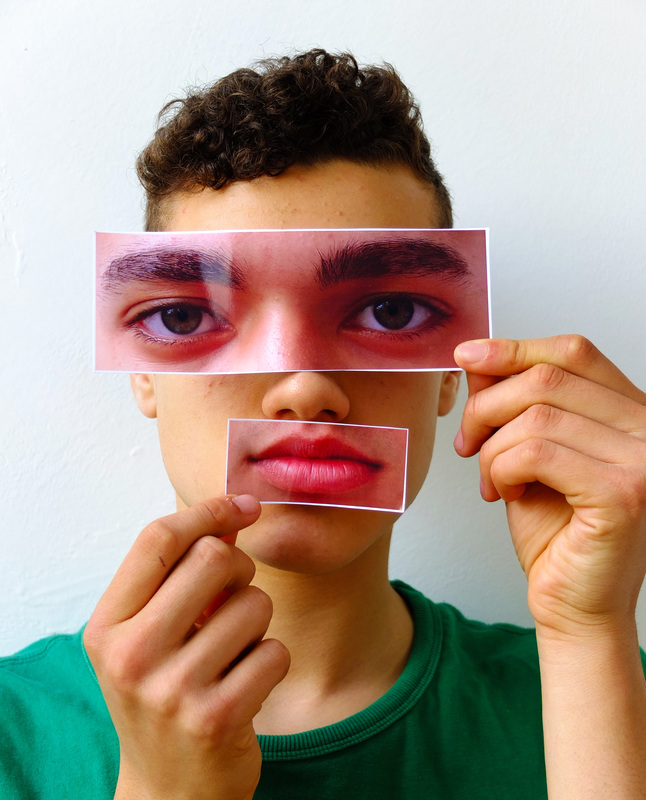
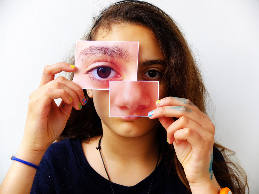
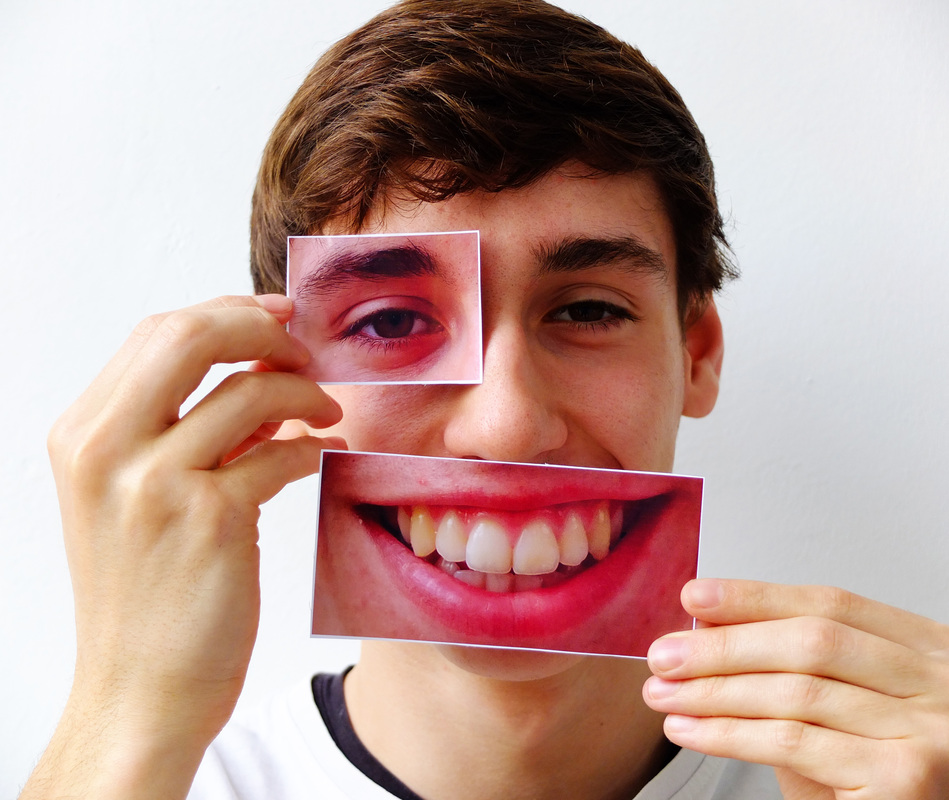
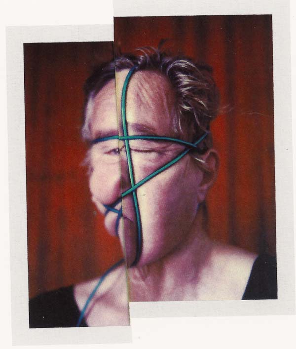
Aim: To continue with the technique used by Stezaker but experimenting with manually cutting photographs of people that i have taken, and rearranging them with a combination of other photos. I thought i would try developing Stezaker's technique by using only one or two features of different faces, and try photographing people holding the images of these features so that they cover the matching feature on their own face.
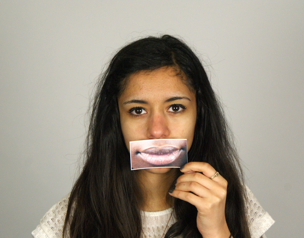
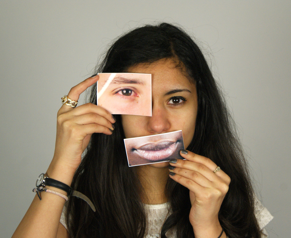
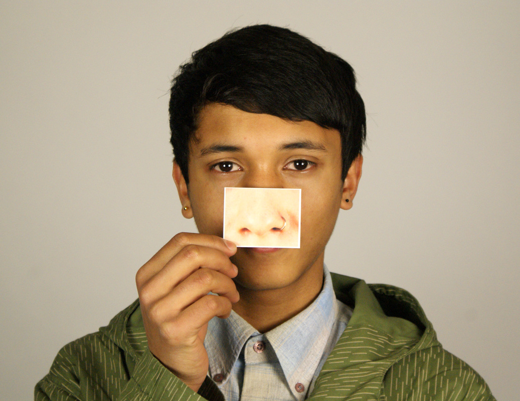
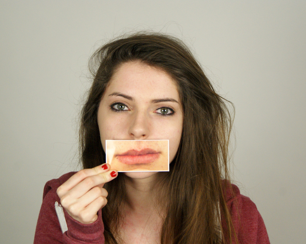
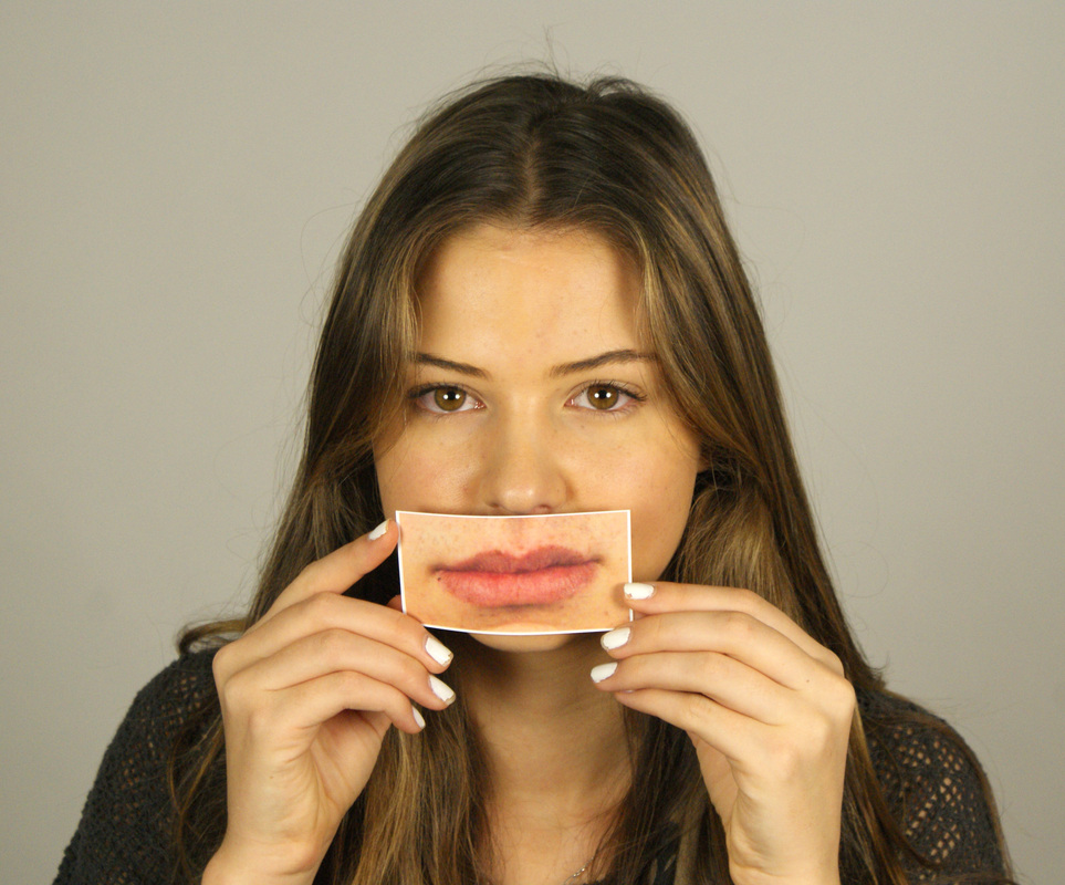
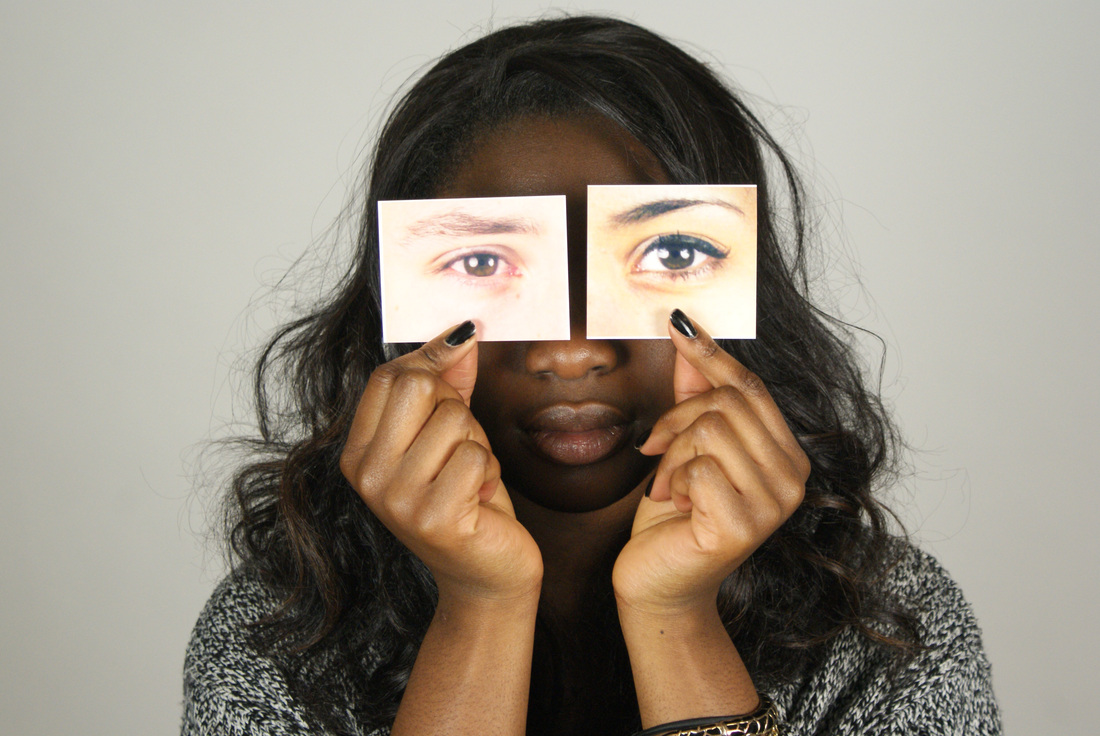
Process: I used the images that i had previously taken and cut out only certain features such as their eyes or mouth; trying to print them so they were a similar size to the real-life characteristics. I then photographed people in my class in the studio holding the paper with a facial feature or someone else so that it changed how their face appeared. In some cases i got the subject to hold to features in the place of their own to surther see how this further altered their image.
Critique: Even though i tried to print the images out in the correct size, i quite like how some of them are too big for the faces of the people holding them because it alienated their appearance even more, adding to the surreal quality of the photos. One problem with the images is that in some of the photos, the pieces of paper are slightly too overexposed meaning that you can't see the image properly.
Further Development: I would like to try this concept again but purposefully trying to make the images on the paper much bigger than in reality. I think the exaggerated proportions of the face will give the images a comical element and wil expand on Stezaker's technique.
|
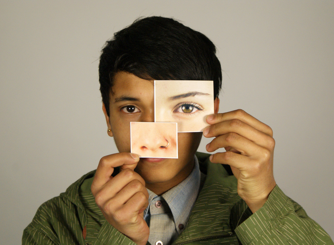
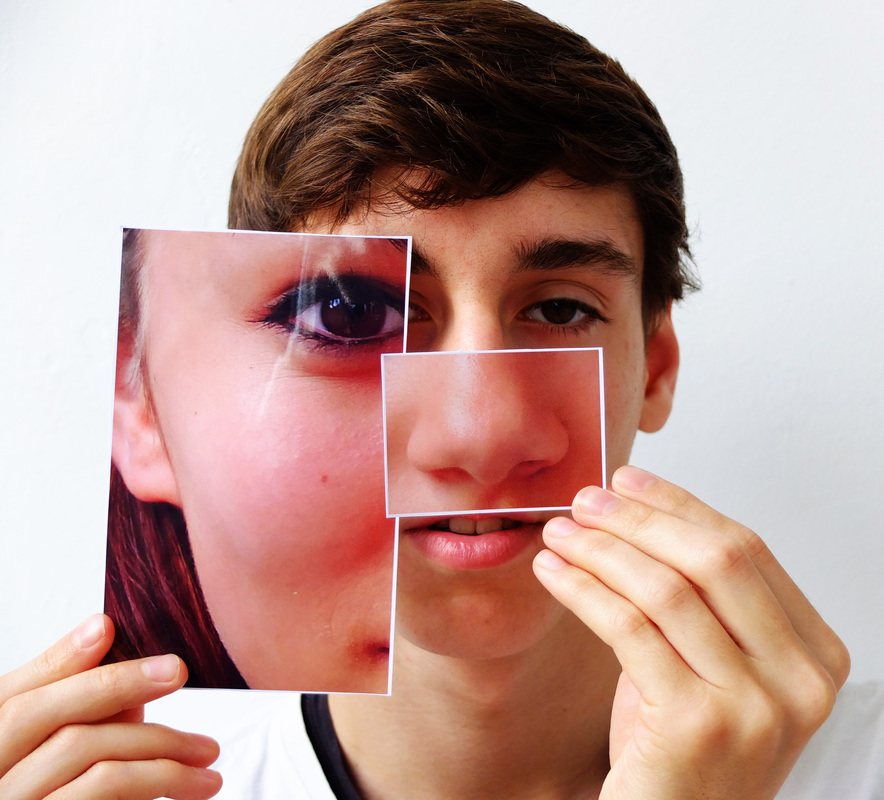
Process: My set above gave me the idea to make an entirely new face cutting and pasting parts from the pictures i had already taken. On photoshop, i cut little parts from each photo and reassembled them onto an existing face for the structure. This resulted in an image that was a combination of 7 different faces - creating a completely unique character who looks nothing like any of the people involved.
Critique: I thought this idea was quite unusual because although it is similar to Stezaker's technique, there is no part of the face that actually resembles the person it belongs to because the picture is made up of so many different parts. I really like this image because it is interesting to look at it and try to make out which feature belongs to who. I think that the different lighting in each image also adds to the photo because it makes the changes in the face more obvious, and i also like how the division of the two faces in Stezaker's work is quite harsh and abrupt. Further Development: Although i like this photo, i think i will continue with photo similar to the set above, and i think it would be interesting to see how it looks with the person holding their own facial features in front of their face instead of someone elses. |
___________________________________________________________________________________________________________________
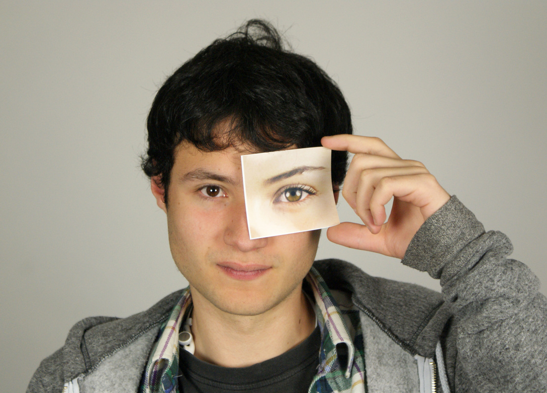
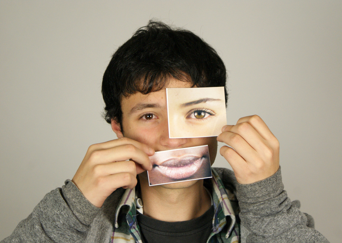
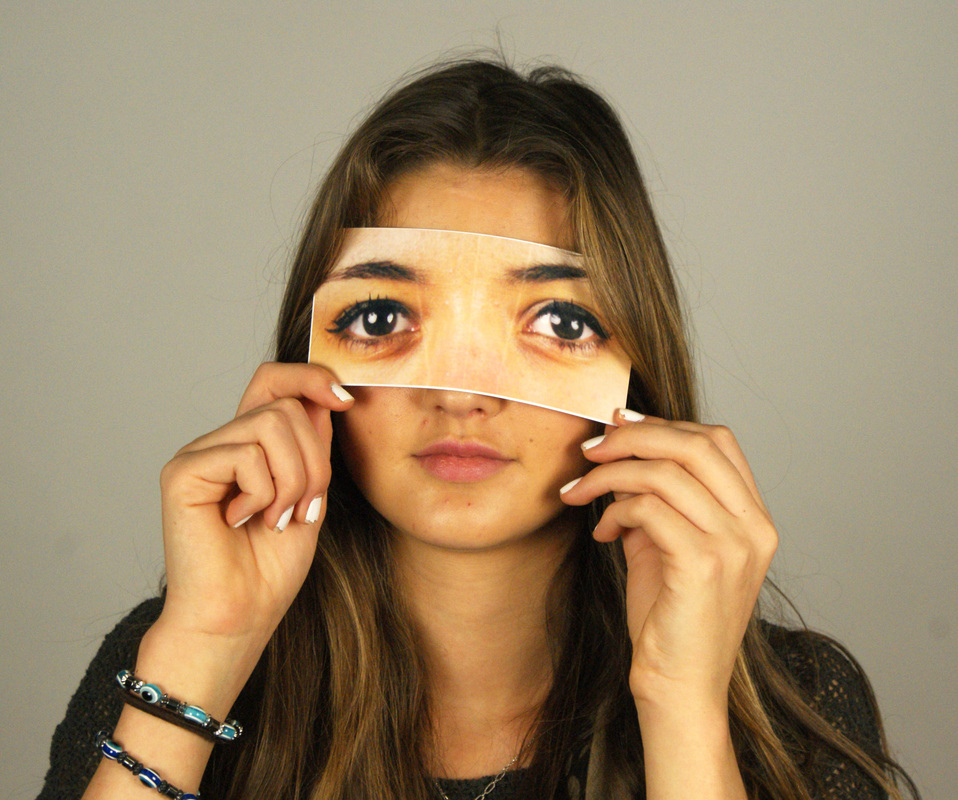
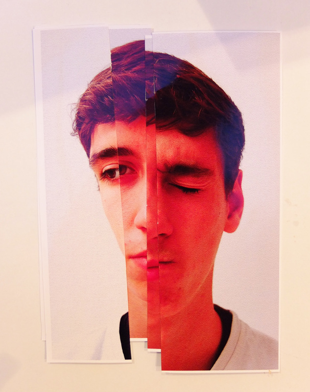
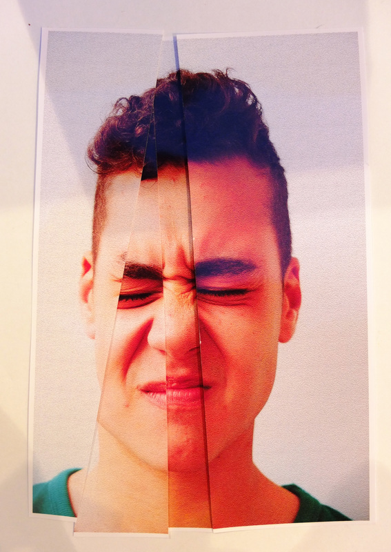
Aim: To take photos similar to my previous set and to also try using images of facial features from the same person that i am photographing.
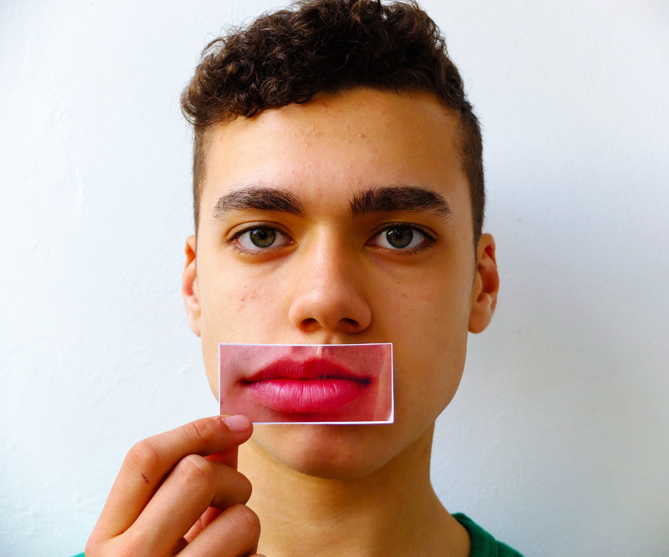
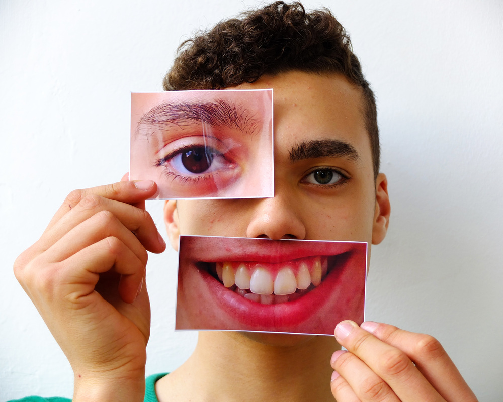
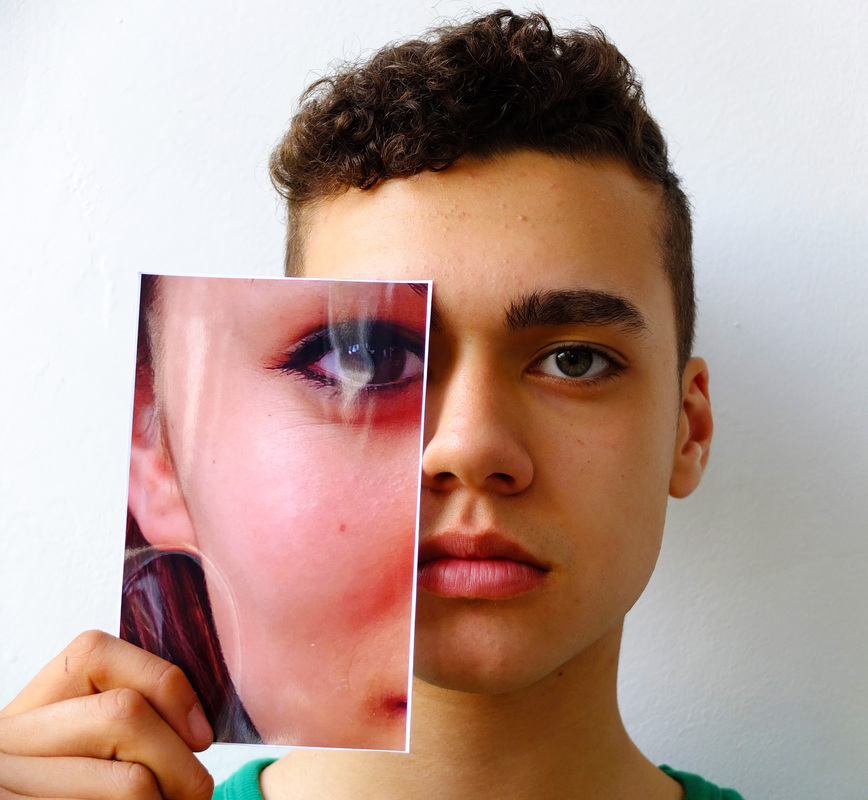
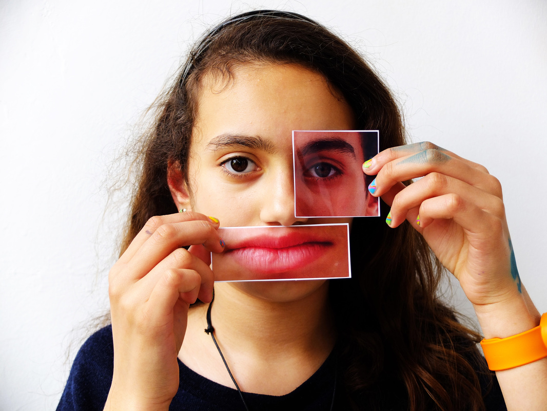
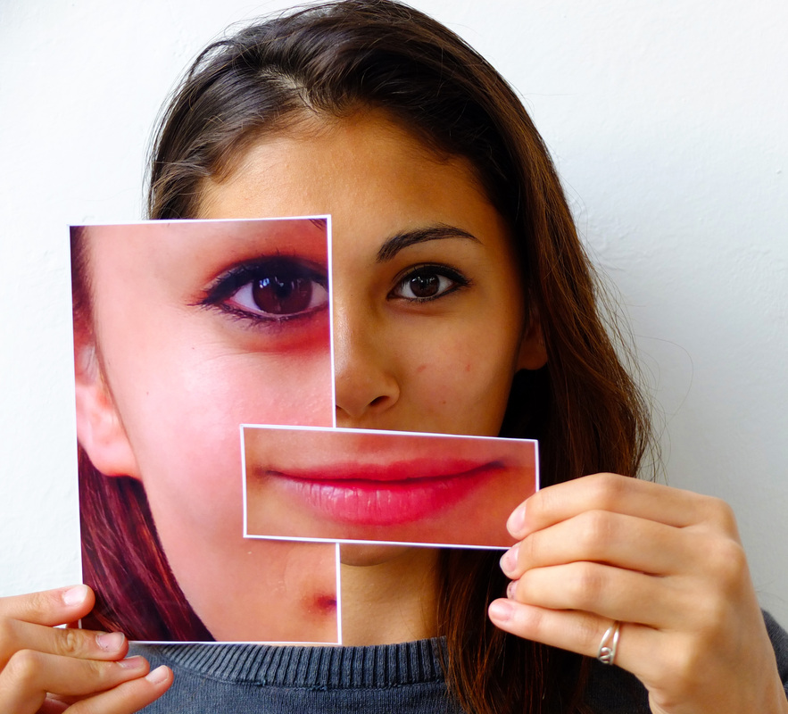
Process: For this set i took photographs of the people above and then cut certain characteristics of their faces out to use for the second photos which are shown above. I purposefully printed them out so they were either too large or too small so that it added a comical quality to the photographs and i thought it would be interesting to try and create different emotions using the images. I then took a second set of photos with the subjects holding different combinations of photographs against a white wall and using natural lighting. The 4 photographs above are the images in which the subjects held their own features against their faces.
Critique: I found that when i took the photographs with the people holding the pictures of the features, the colour of the photos on the paper are quite different to the images of the people, and aren't always very visible because of the lighting.
Further Development: After experimenting with this idea i do quite want to try the manual technique of cutting and pasting different images together like Stezaker. However i found two artists called Anna and Bernhard Blume who create images using a similar method to Stezaker only using images of the same person.
___________________________________________________________________________________________________________________
Anna and Bernhard Blume:
Anna and Bernhard Blume are german artists well known for their sequences of large black-and-white photos of staged scenes in which they appeared themselves, with objects taking on a "life" of their own. The scenes are often reduced, estranged, and above all odd: and chaos seems to be mutually conditioning. Role-playing and convention inhere in each object, conditioning modes of behaviour and provoking resistance. With their diagnoses of the contemporary conditions, the works of Anna and Bernhard consistently interweave performance, painting, and photography.
|
|
The photos above by Anna and Bernhard from the series 'Plaster-Elaste' are quite similar to those by Stezaker, however they are much more surreal and unnerving than Stezaker's photos. The people in these images have been cut up and rearranged so much that they almost look alien, and unlike Stezaker this is not only limited to their eyes; making the person barely recognisable. Anna and Bernhard have also adjusted the colours of the images which further adds to the estranged quality of their work - as well as the deformation of their features due to the structures surrounding the face which creates quite a disturbing effect. I came across this work and thought it related well to my project as i have been experimenting with similar techniques. I thought the idea of eliminating the features instead of enhancing them like i have been doing was quite an interesting way of making people unrecognisable and distorted. Because i have mostly been merging the faces of two or more different people, i think it would be interesting to see if this works better by combining and overlaying the same face using different images of the same person.
___________________________________________________________________________________________________________________
Response to Anna and Bernhard Blume:
Aim: My aim for this set is to experiment distorting the human face using the Anna and Bernhard's technique of cutting and pasting cuttings of images of the same person at different angles to create a disfigured and warped face.
Process: I created these images by taking photos of the same person making different expressions with their faces. I then edited the images; slightly changing the colour and texture of them like Blume did, and printed them out so i could cut making incisions in the photographs and then assembled them so the created a distorted and fragmented version of the face.
Critique: I like how the resulting images eliminate parts of the face so that you might only see half of one eye or part of the mouth. The images looked much better in person but when i took a photo of the colour change was exaggerated so that it is quite difficult to see some of the detail in the image.
Further Development: These images and the images by Anna and Bernhard Blume gave me the idea of eliminating some of the facial features rather than amplifying them with the images of the enlarged characteristics. It is hard to tell the expressions of the people in the photographs, so this idea might emphasize this idea if the person has no facial features.
___________________________________________________________________________________________________________________
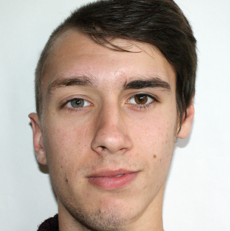
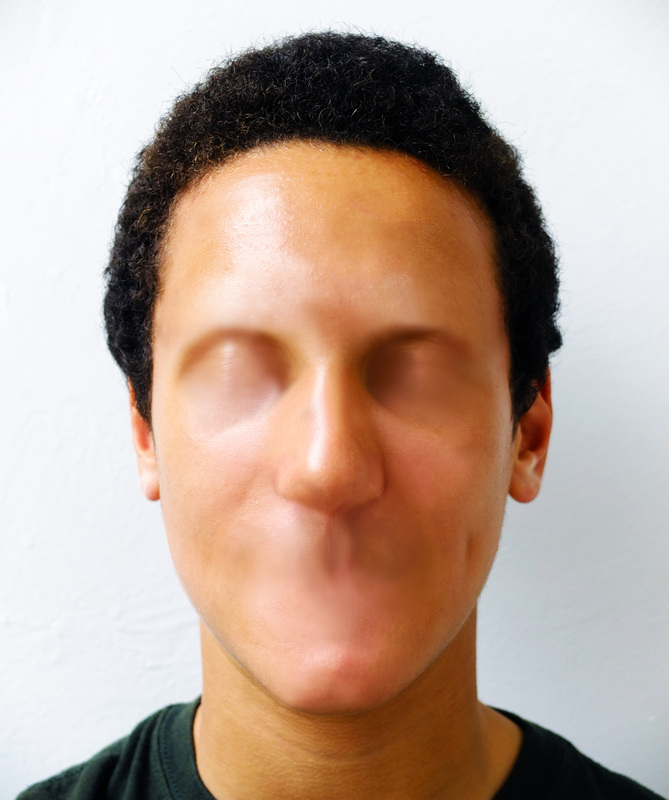
Aziz and Cucher:
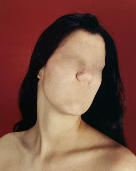
Aziz and Cucher are visual artists working together as a collaborative team. They are pioneers in the field of digital imaging and post-photography with projects exhibited at numerous venues including the 1995 Venice Biennale, the LA County Museum of Art and the San Francisco Museum of Modern Art. Aziz + Cucher have worked in many media including digital photography, video installation, sculpture, and textiles. They were among the first to use Adobe Photoshop in the context of fine art photography. The resulting series of images (1992–2002) can be seen as a commentary and reflection on the relationship between the human body and the technological forces that shape our society. Their collaborative interest is in "creating visual metaphors for the increasing role that new technologies play in our lives and how they affect us politically, socially, and psychologically." They explore the possibilities for human beings in a time when we can transform ourselves and nature from "known forms into unknown forms" as a result of the potential inherent in the coming together of computer science, biotechnology, genetics and nanotechnology.
The Dystopia series is probably Aziz + Cucher’s most widely known work which consists of large digitally manipulated portraits in which the orifices—eyes, mouth and nostrils—have been covered by a layer of skin. The intention was to suggest an evolutionary change signifying the loss of individuality in the face of advancing technology and the progressive disappearance of face-to-face, direct interaction. The images were described by art critic Adrian W.B. Randolph as follows, ‘dystopia, seems to document a pathology. it seems clear that at some level this pathology is not only dermatological, but cultural, commenting, perhaps, on the gradual but waxing loss of identity and the means of communication in a technological environment that promotes anonymity and conformity’.
The Dystopia series is probably Aziz + Cucher’s most widely known work which consists of large digitally manipulated portraits in which the orifices—eyes, mouth and nostrils—have been covered by a layer of skin. The intention was to suggest an evolutionary change signifying the loss of individuality in the face of advancing technology and the progressive disappearance of face-to-face, direct interaction. The images were described by art critic Adrian W.B. Randolph as follows, ‘dystopia, seems to document a pathology. it seems clear that at some level this pathology is not only dermatological, but cultural, commenting, perhaps, on the gradual but waxing loss of identity and the means of communication in a technological environment that promotes anonymity and conformity’.
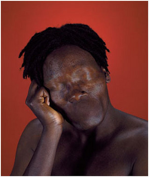
Analysis:
Form: The Dystopia series were external portraits of subjects that had "turned inwards." This colour photograph by Aziz and Cucher shows two normal looking people, expect their eyes, mouth and nostrils have been removed leaving only skin. The subjects appear to be atleast topless, and although they are women they both have short dark hair. The person on the right has their head tilted back slightly; subtly leaning againt the person behind them while they both their bodies face to the right with their heads look at the camera. The background is simple; a mid-blue colour with an almost lego-like pattern.
Process: These are digital photographic manipulations of portraits created using Photoshop. Aziz and Cucher digitally erased the eyes, the nose, the mouth, and the eyebrows - covering these areas with a layer of skin so the faces appear to have no identity. Content: Aziz and Cucher are good examples of how photography can represent possibilities rather than just reality. The Dystopia series is all about the human loss of our own identification and our relationship with the ever changing technological society that we are constantly evolving in and adapting to. |
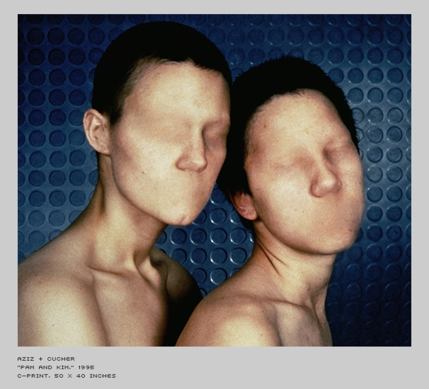
Pam and Kim, 1995
|
Which ever way you look at it, the Dystopia series portrays the breakdown of both the physical and personal identity of humans within modern society, as a result of our growing obsession with technology. By removing the face of a human, we remove its humanistic qualities, emotions and personality, making it no longer unique- we are evolving into the machines. I believe its this lack of human interaction that we are experiencing which inspired Aziz and Cucher to cover the faces within the series with skin, as it is with our face that we are prone to interact. We use our eyes to engage with people, our mouth to speak and our nose to breathe- perhaps by covering the nostrils with skin it suggests technology is making us more and more lifeless.
___________________________________________________________________________________________________________________
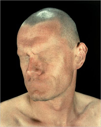
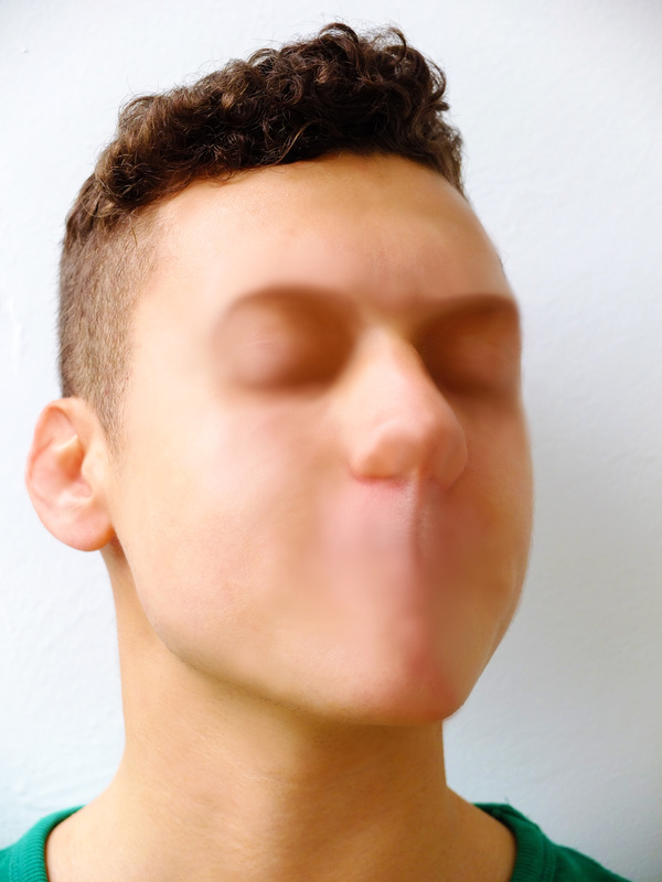
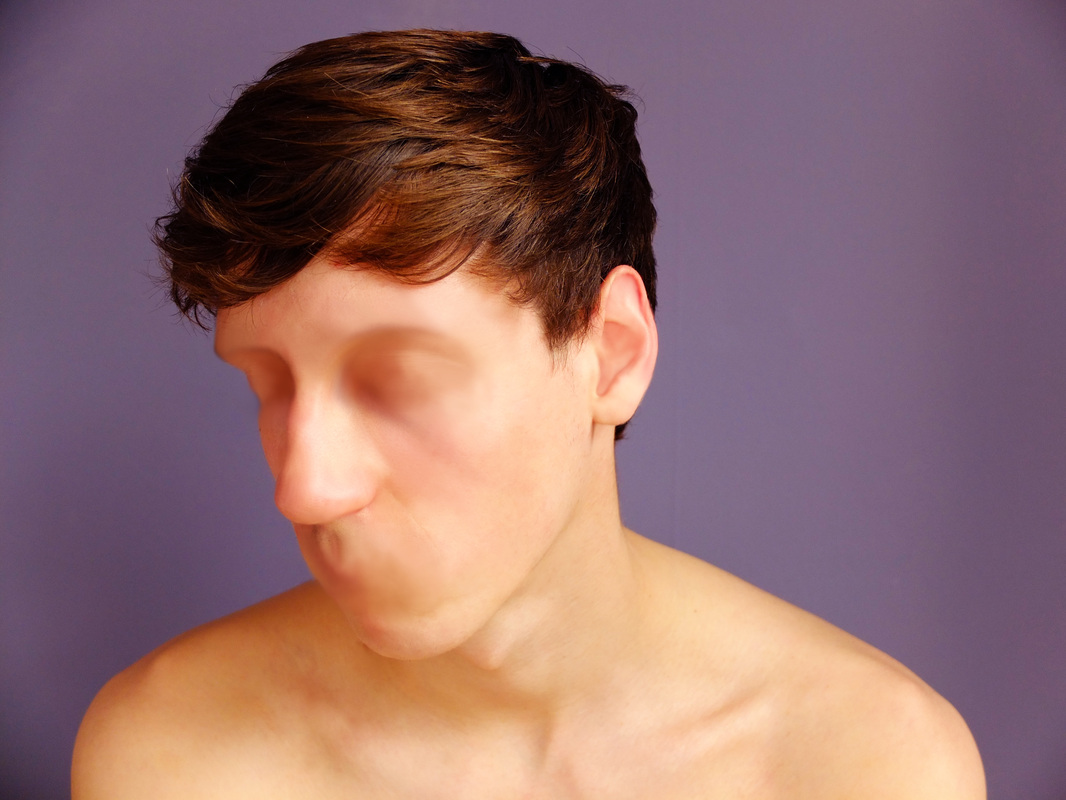
Response to Aziz and Cucher:
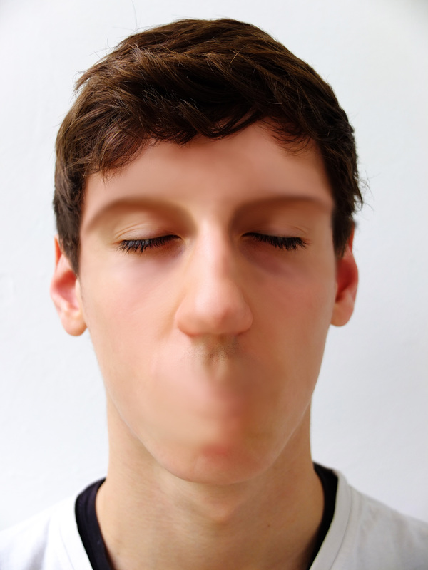
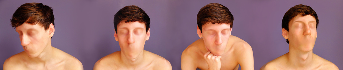
Aim: To respond to Aziz and Cucher by experimenting with photoshop to eliminate the features of the face from photographs that i have already taken.
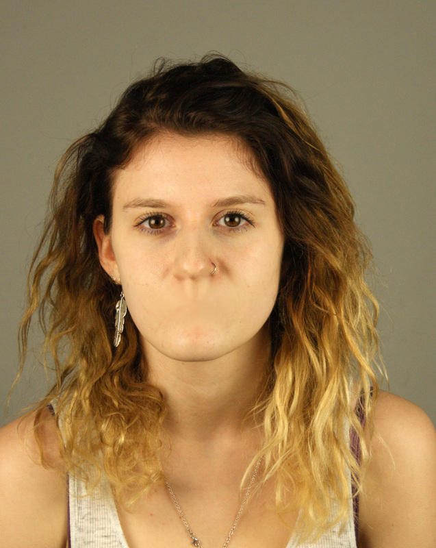
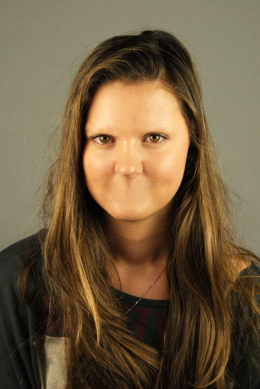
Process: For the images above i used the Clone Stamp tool on photoshop to clone parts of the skin and then cover the nose, eyebrows and mouth. I then edited the images to improve their appearance; changing the contrast and brightness as i like the contrast in Aziz and Cucher's work.
Critique: I found this process quite hard, but i thought the resulting images were really effective because it really looks like they are missing certain features. I tried covering the eyes as well but i thought it would be easier to do this well if i took photos of people with their eyes closed as there will be much more skin to clone and i will be able to use the lighting and contours of the eyes.
Further Development: I would like to continue this idea by taking pictures of people's faces at different angles with their eyes closed, and trying to get rid of all their features so they appear to have a blank face.
___________________________________________________________________________________________________________________
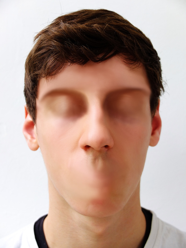
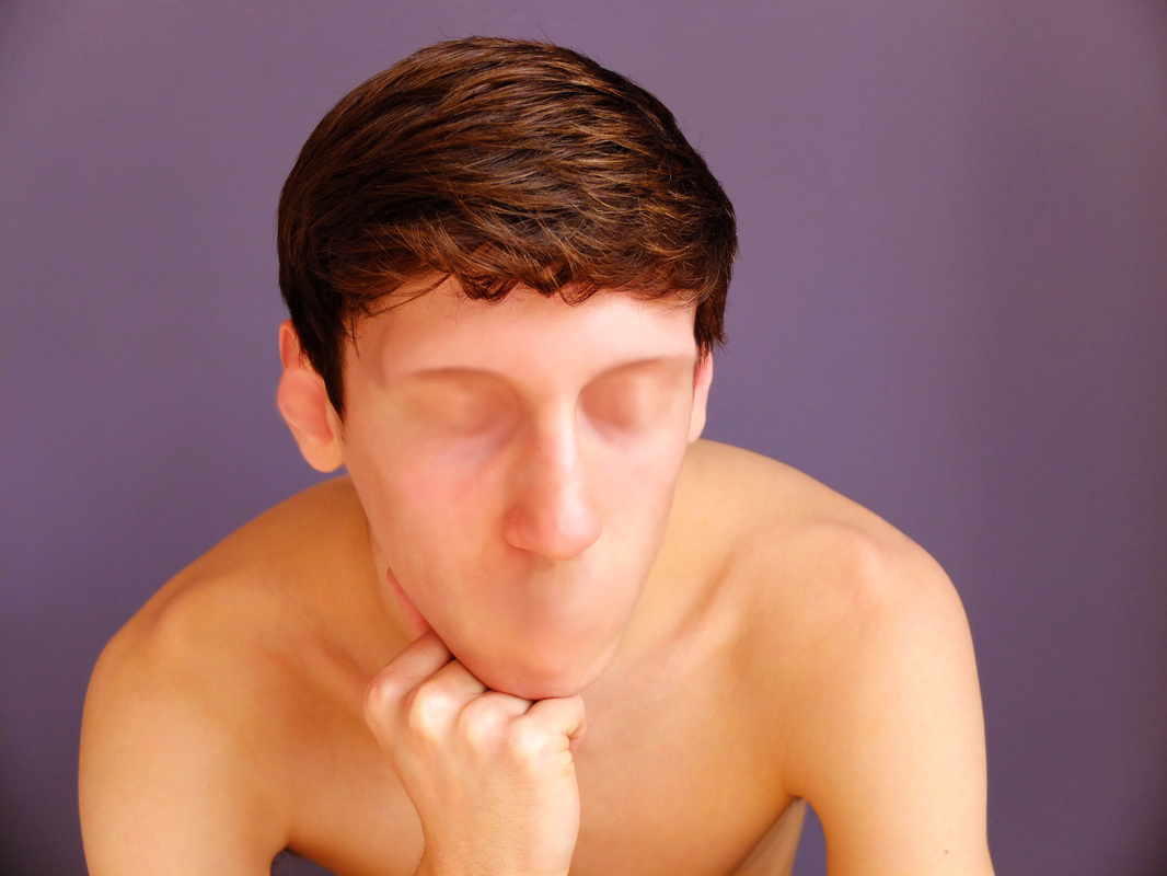
Aim: To use this technique to remove all of the facial features of people with their eyes shut.
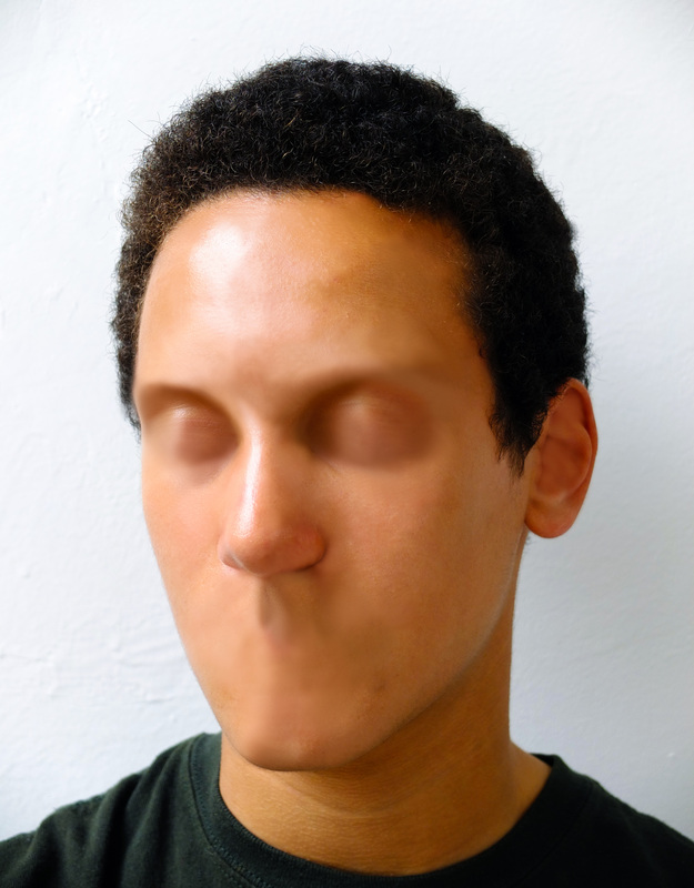
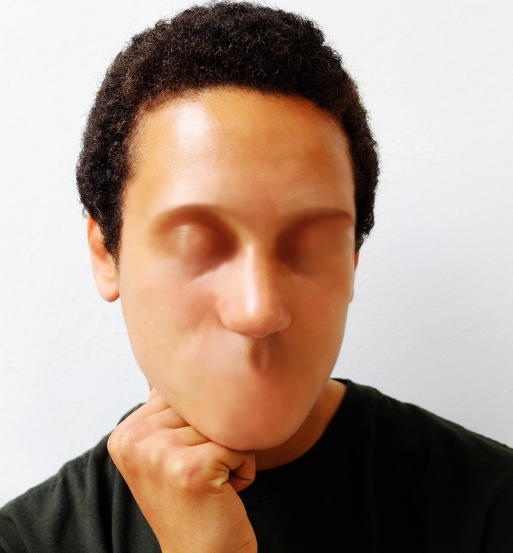
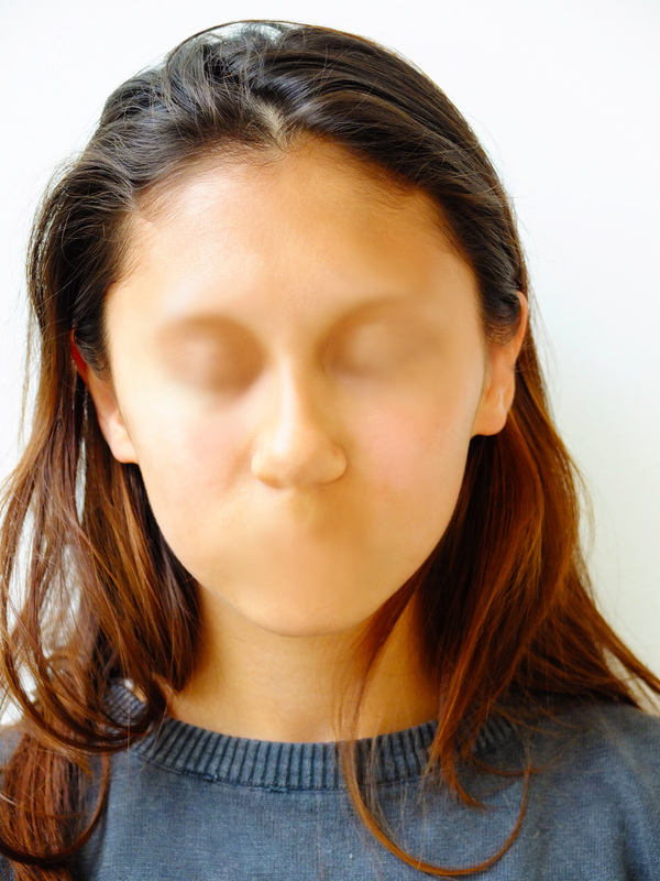
I used the same technique as my previous set, only for these pictures i tried to get rid of all the blemishes and marks on the face that gave them any sort of identity. This gave the images quite a waxy look - as if they aren't real people. I tried this technique out on the same face at different angles three times and thought it would be an interesting outcome if i merged the 3 photos together.
___________________________________________________________________________________________________________________
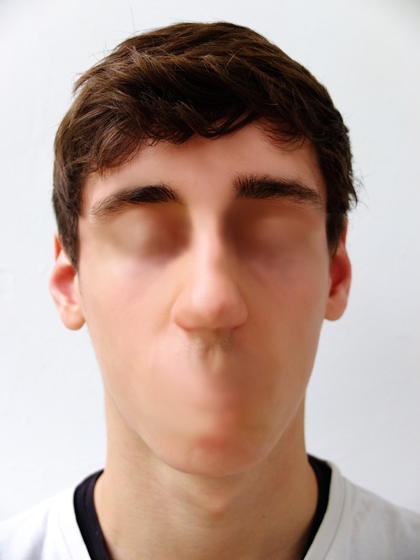
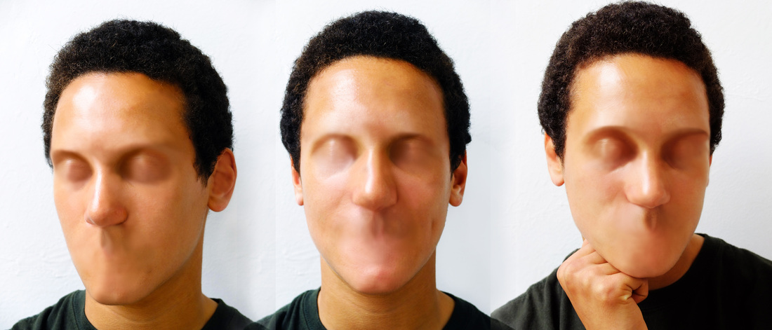
Exam Ideas:
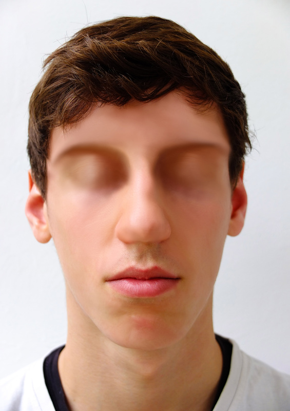
For my final outcome i would like to use this idea of eliminating the facial features using Aziz and Cucher's technique. I really like the outcomes that i have produced because without the features the faces appear to have no expression while also appearing very surreal and disturbing. I like how the photos become to look like paintings because i have had to sculpture the face while erasing the features, which adds to the alien effect because you can't quite tell if they're real or not. For one of my outcomes i thought it would be interesting to try doing this technique on the same face multiple times with different expressions; creating a panorama type photo by joining the images together on photoshop.
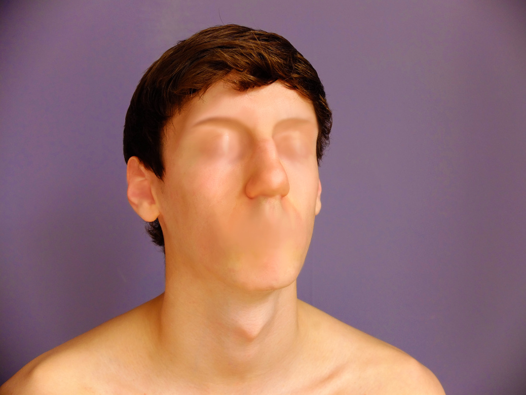
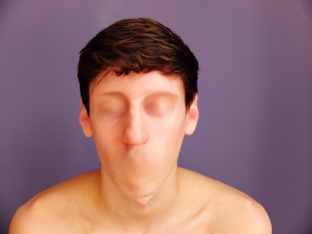
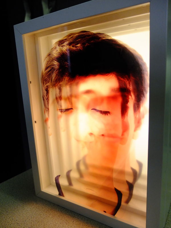
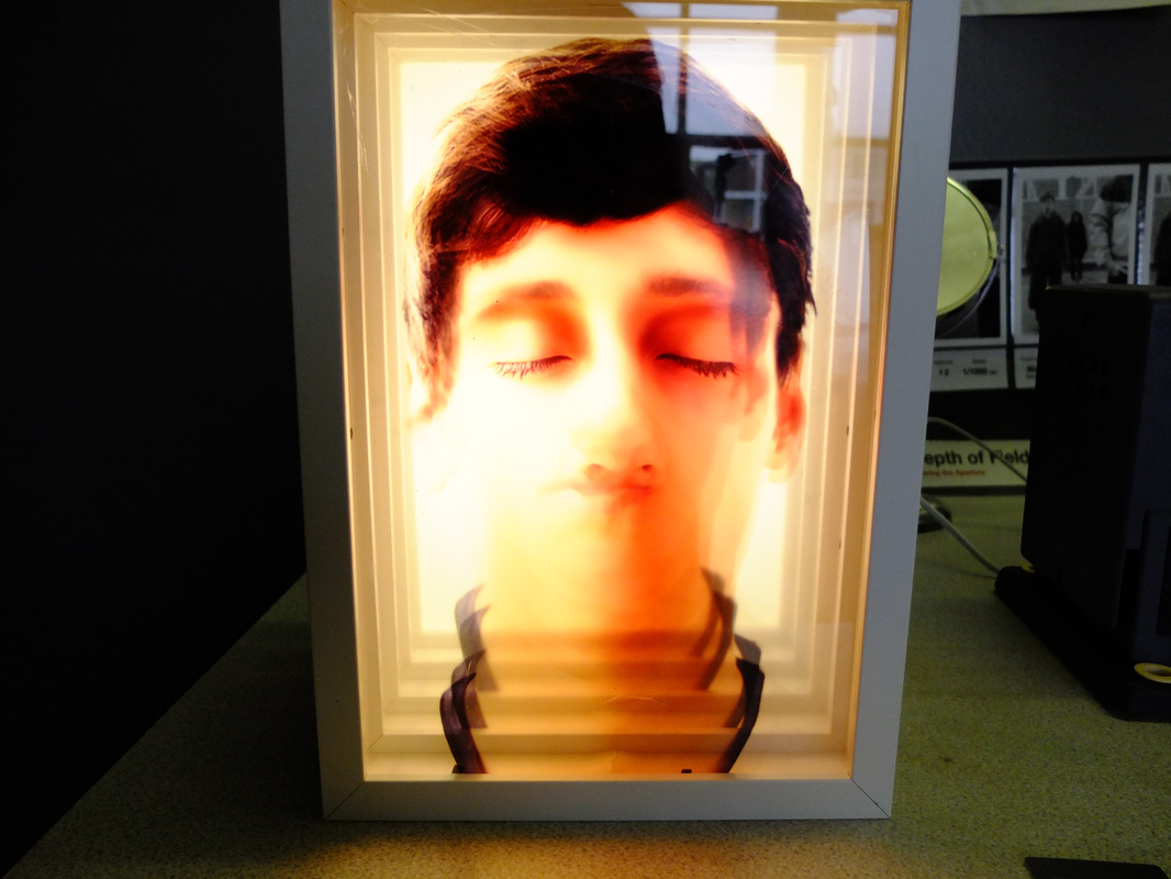
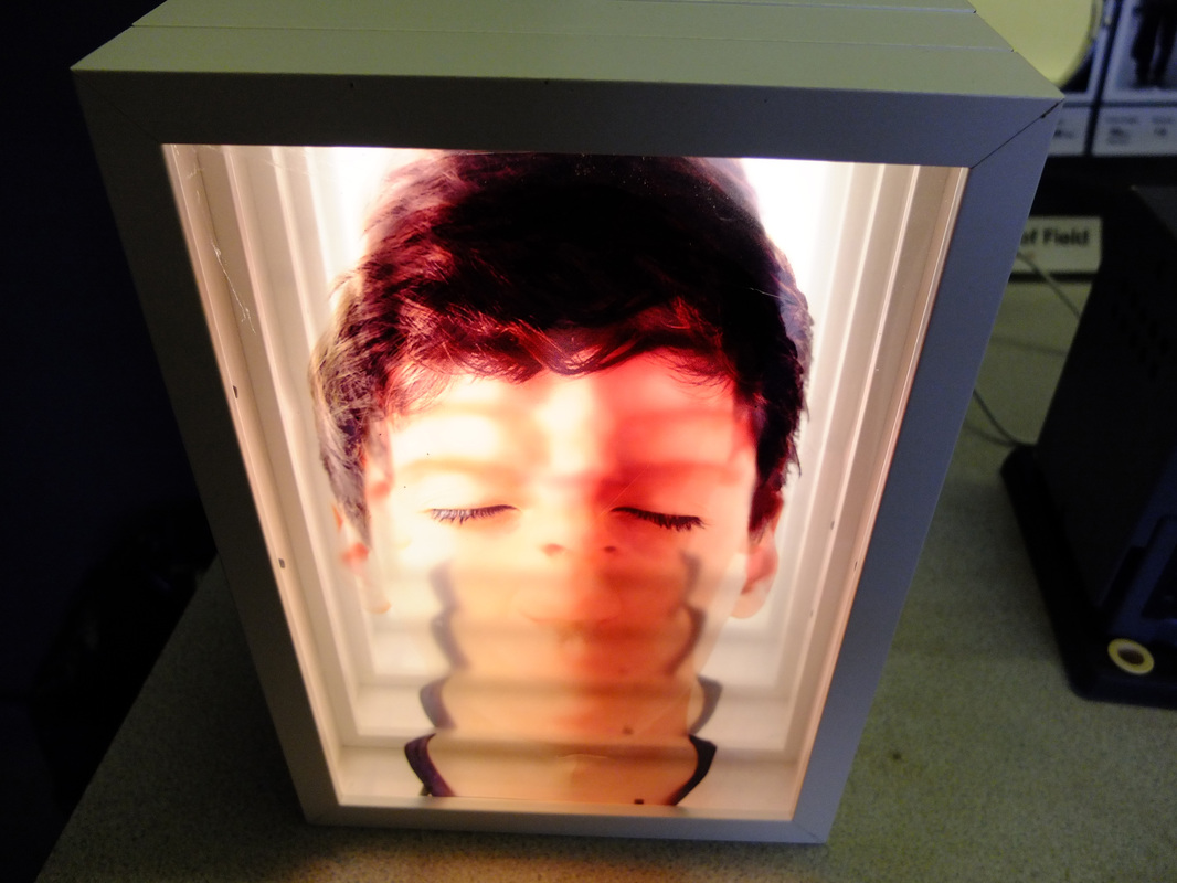
I took these photos against a purple wall because i really like the colours backgrounds Aziz and Cucher used in their images, and i thought that the white backgrounds in my previous sets were quite boring and washed the person in the photo out a bit. I think edited the photos on Photoshop; eliminating the features of the face using the Clone Stamp Tool, and adjusting the colour and contrast of the images to improve the quality - making sure they were roughly the same as each other. I really like the finished outcome of all the images combined together and i think they look much better with the coloured background because it makes the image much more vibrant the figure in the photo stand out. While making this i thought it might be a nice idea to try making a lightbox using photographs that i have edited using this technique. It might be interesting have a few photos of the same face, but with one different feature in each photo. When you look directly through the light box you would be able to see the whole face, and would see different angles of the dismantled face when you looked at the images from a different perspective. It might be a good idea to practise making a light box using photos with a similar concept to see if this idea will work.
___________________________________________________________________________________________________________________
Making a Light Box:
I made my lightbox using 5 thick frames which i could stick together to create a box, but i could also use to hold the pictures that will be lit up. For my experiment i used 20 small LED lights which i stuck to the back of the last frame; gluing aluminium foil around them and covering with white paper to diffuse the light. I then screwed the frames with the pictures already inside together using screws and a screw driver. I tried this experiment out using 4 pictures of my family members which i printed onto acetate so that you would be able to see each face when you looked through the box. I made sure the faces in each picture were the same size and that the features were roughly aligned so that it would look like one person from a combination of these four faces when you looked at them directly, and when you looked at the faces from an angle you could see each individual face or a combination of two or three of them.
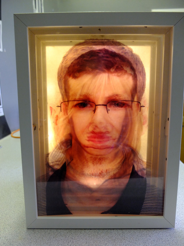
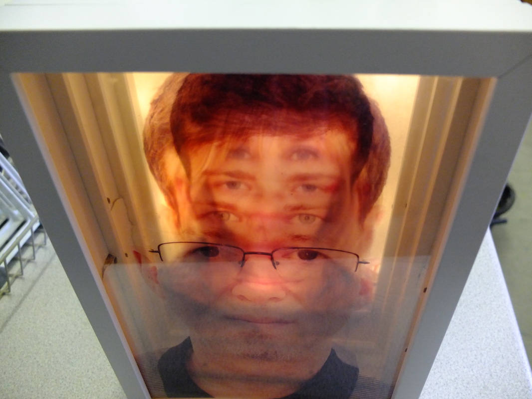
I thought the concept of this idea was really interesting because i liked how you didn't just see the images from one angle, and the appearance of the faces was altered depending on how you looked at them. Using the photos of my family carried on from looking at the similarities and differences between them, and i liked how the four images created an entirely new figure which looked quite surreal and ethereal, however i thought this would work better using images like Aziz and Cucher's work. I think using the same principle as the light box i just made but using four images which only had one feature each such as the mouth in one photo and the eyes in another and then combining them in the light box so that you were able to see both the broken down and the entire combined face.
I would also have to make some changed to the light box as the lights i used weren't bright enough so you could only really see the faces properly when the light box was in a dark room. I will also use opaque perspex instead of paper because the paper didn't properly diffuse the light and you could still see little circles behind the images where the light was more concentrated.
I would also have to make some changed to the light box as the lights i used weren't bright enough so you could only really see the faces properly when the light box was in a dark room. I will also use opaque perspex instead of paper because the paper didn't properly diffuse the light and you could still see little circles behind the images where the light was more concentrated.
___________________________________________________________________________________________________________________
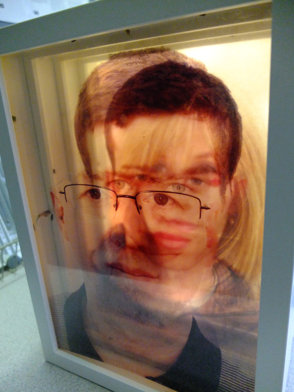
Final Outcome:
For my second light box i took into account the changes that had to be made, and i used fluorescent lights instead of the LED lights so that they emitted more of a glow rather than lots of small concentrated lighting. I also used opaque perspex instead of the paper to diffuse the light more so that it was even throughout the light box; also separating it from the lights using another frame so that it wasn't too close to them and diffused it even more.